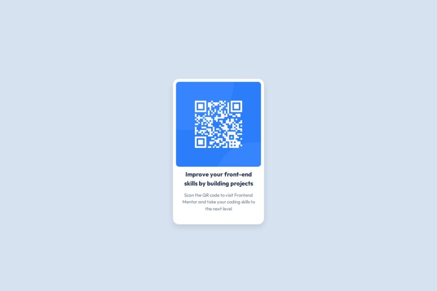
Design comparison
Solution retrospective
I've never liked CSS before. I finally managed to face my fears and complete this simple project, which I think is a good beginning steps.
I haven't learned enough to know what I'd do differently next time. I'll see if I can learn more and figure out what I'd need to do different as I go
What challenges did you encounter, and how did you overcome them?Starting from scratch was mentally exhausting. It's just about willpower.
Community feedback
- @SvitlanaSuslenkovaPosted 7 months ago
I see you added flex, but your project didn't align to the center. The problem is you should add to your flex also min-height: 100vh; Currently, the height of the body is the same as the component in it.
1 - P@MikDra1Posted 7 months ago
If you want to make your card responsive with ease you can use this technique:
.card {
width: 90%;
max-width: 37.5rem;
}
On the smaller screens card will be 90% of the parent (here body), but as soon as the card will be 37.5rem (600px) it will lock with this size.
Also to put the card in the center I advise you to use this code snippet:
.container {
display: grid;
place-items: center;
}
Hope you found this comment helpful 💗💗💗
Good job and keep going 😁😊😉
0
Please log in to post a comment
Log in with GitHubJoin our Discord community
Join thousands of Frontend Mentor community members taking the challenges, sharing resources, helping each other, and chatting about all things front-end!
Join our Discord
