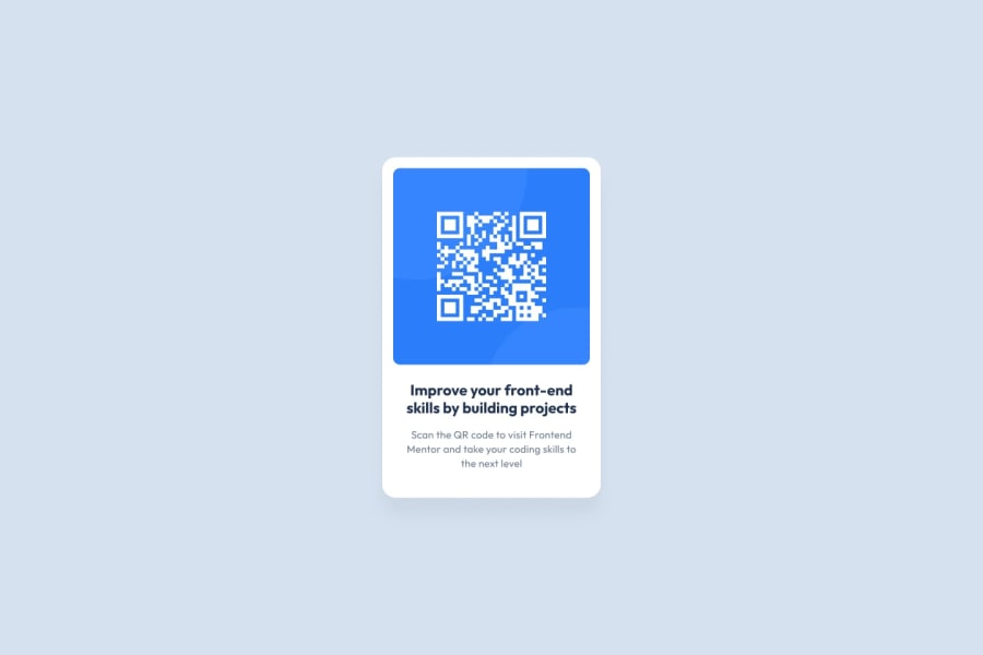
Design comparison
Solution retrospective
I tried for awhile to nail the sizing as that's something that I've been struggling with a lot. If you have any tips or pointers please comment them! I think github pages shifted my box to the right a bit so if its messed up I'm sorry.
Community feedback
- @lucasbsandPosted 9 months ago
Your solution is very faithful to the example. If you don’t mind, I would like to give you two suggestions that could add more value to your project (one of them is valid even for future projects)
-
First, perhaps increasing the font size of the text in the h3 and p tags could make your QR code even more similar to the example
-
To calculate the ‘border-radius’ of a child element whose parent has a padding (as is the case with the image with the QR code), you should do the following: ‘parent-border-radius’ - ‘parent-padding’ = 'child-border-radius'. This will make the child have a border radius that is more consistent with that of the parent
Note: this text was translated using an artificial intelligence, since I am not completely fluent in English, sorry if it is confusing what I meant to say
Marked as helpful0@N4thxnPosted 9 months ago@lucasbsand thank you for your response! I was unaware of the border-radius trick you just taught me. I will be sure to use it in future challenges!
1 -
Please log in to post a comment
Log in with GitHubJoin our Discord community
Join thousands of Frontend Mentor community members taking the challenges, sharing resources, helping each other, and chatting about all things front-end!
Join our Discord
