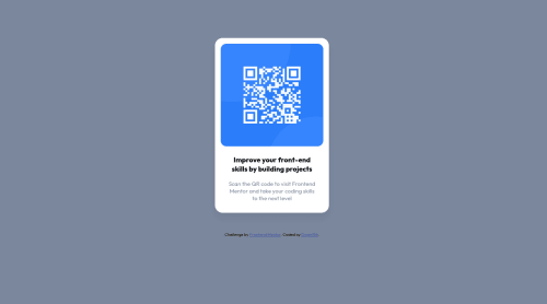
Design comparison
SolutionDesign
Solution retrospective
Please feel free to point out any errors or suggestions on things I could have done better. I would love for you to share with me things you learned through years of experience that could make me better at writing codes. Please feel free to drop any resources you think could be helpful. Thanks.
Community feedback
- @TH3RIVPosted almost 2 years ago
Hi, @doyin156!
Your project is not far from being finished, here's a few suggestions to make it even better:
- Your page should contain landmarks, so it makes your code easier to read on what content is what and also helps screen-readers to figure out what is what. In this case your card should be wrapped withing
main
tags and your attribution should be wrapped withinfooter
tags. - You are writing your CSS within the HTML, I would suggest making a separate file for CSS. Imagine this was a big website with a lot of styling and markup.
- Your body is the wrong colour. You are using the text colour. Background should be
Light gray: hsl(212, 45%, 89%)
. - You are using a
h3
without ah1
. Headings are supposed to follow the hierarchy (h1 > h2 > h3 > etc...). In this case it should be ah1
element. You can adjust the font size with CSS. - Try to avoid using
margin
to center your objects. For centering your card I would suggest looking up "Flexbox". - Try to avoid using
px
values as much as possible and userem
instead.
Hope this helps!
Marked as helpful0 - Your page should contain landmarks, so it makes your code easier to read on what content is what and also helps screen-readers to figure out what is what. In this case your card should be wrapped withing
Please log in to post a comment
Log in with GitHubJoin our Discord community
Join thousands of Frontend Mentor community members taking the challenges, sharing resources, helping each other, and chatting about all things front-end!
Join our Discord