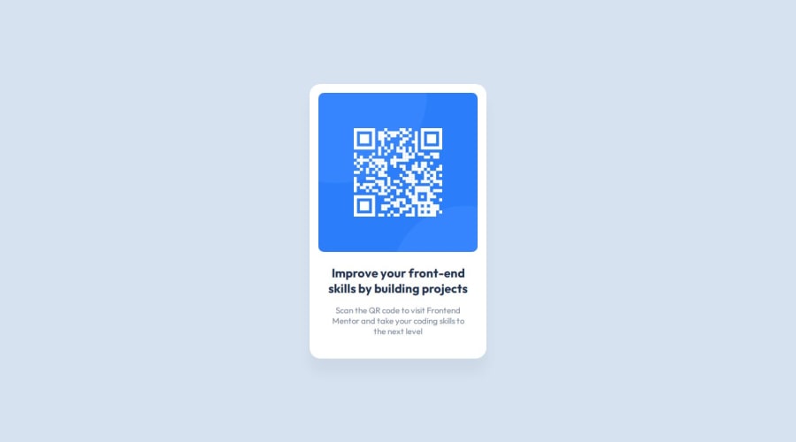
Design comparison
Solution retrospective
I am proud that it looks exactly the same as the design as far as I can tell. Next time, I hope I can finish it faster.
What challenges did you encounter, and how did you overcome them?I always have difficulty coming up with class names
What specific areas of your project would you like help with?If my HTML is correct and I'm using best practices
Community feedback
- P@nvallinePosted 12 months ago
Hi,
Good job on the challenge. I did notice that the box shadow isn't quite the same as the design. You can fix it by updating your CSS with the following:
box-shadow: 0 25px 25px 0 hsl(0, 0%, 0%, 0.0477)
If you are able to access the Figma file, I was able to find the values here: Desktop > Group 3 > Rectangle. Using HSL also stays inline with the other colors.
I hope that helps.
Marked as helpful1P@cgebPosted 12 months ago@nvalline Thank you! I had trouble figuring out how to get the box-shadow values from Figma
0
Please log in to post a comment
Log in with GitHubJoin our Discord community
Join thousands of Frontend Mentor community members taking the challenges, sharing resources, helping each other, and chatting about all things front-end!
Join our Discord
