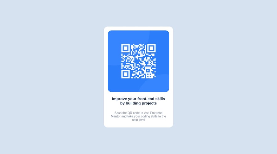
Design comparison
Solution retrospective
All Feedback is welcomed
Community feedback
- @0xabdulkhaliqPosted over 1 year ago
Hello there 👋. Congratulations on successfully completing the challenge! 🎉
- I have other recommendations regarding your code that I believe will be of great interest to you.
QR iMAGE ALT TEXT 📸:
- Since this component involves scanning the QR code, the image is not a decoration, so it must have an
altattribute.
- The
altattribute should explain the purpose of theimage.
- E.g.
alt="QR code to frontendmentor.io"
<img src="/images/image-qr-code.png" alt="QR code to frontendmentor.io">
.
I hope you find this helpful 😄 Above all, the solution you submitted is great !
Happy coding!
Marked as helpful0 - @Fernando-BentoPosted over 1 year ago
Hello! 👋
I wanted to share an amazing suggestion for your website! I believe it would be an excellent idea to add a box-shadow to the div#card to create a depth effect.
By applying the box-shadow, you can add a subtle layer of shadow around the div, giving it a more elegant and three-dimensional appearance. This simple detail can truly make a visual difference, making the div stand out and capturing users' attention.
This small addition can bring a touch of sophistication to your card, providing a visually pleasing experience for your website visitors. 👍😊
Marked as helpful0
Please log in to post a comment
Log in with GitHubJoin our Discord community
Join thousands of Frontend Mentor community members taking the challenges, sharing resources, helping each other, and chatting about all things front-end!
Join our Discord
