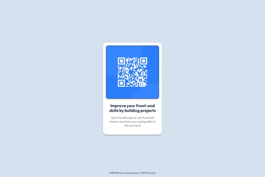
Design comparison
SolutionDesign
Solution retrospective
What are you most proud of, and what would you do differently next time?
I am pleased with the likeness to the original design I achieved and it was good to get some experience using CSS variables as it was the first time for me to use them.
What challenges did you encounter, and how did you overcome them?I struggled a little with getting the correct spacing and think there are still some slight differences between my version and the original design. I overcame this problem by checking the Figma design for more details.
What specific areas of your project would you like help with?How to handle variables in CSS, good practices, when to use variables and when not to, etc.
Community feedback
Please log in to post a comment
Log in with GitHubJoin our Discord community
Join thousands of Frontend Mentor community members taking the challenges, sharing resources, helping each other, and chatting about all things front-end!
Join our Discord
