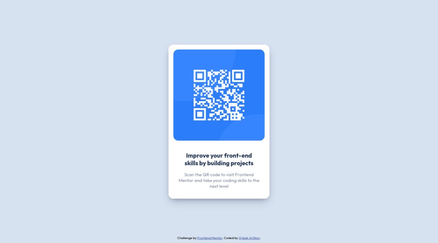
Design comparison
Solution retrospective
If you have any advice to share you are more than welcome!
Community feedback
- @correlucasPosted about 2 years ago
👾Hi @artikov, congratulations on your solution!👋 Welcome to the Frontend Mentor Coding Community!
Great solution and a great start! From what I saw you’re on the right track. I’ve few suggestions for you that you can consider adding to your code:
- Use
<main>instead of a simple<div>this way you improve the semantics and accessibility showing which is the main block of content on this page. Remember that every page should have a<main>block and that<div>doesn't have any semantic meaning. - Replace the
<h2>containing the main title with<h1>note that this title is the main heading for this page and every page needs one h1 to show which is the most important heading. Use the sequence h1 h2 h3 h4 h5 to show the hierarchy of your titles in the level of importance, never jump a level. - Reduce your code by removing unnecessary elements. The HTML structure is working but you can reduce at least 20% of your code by cleaning the unnecessary elements, you start cleaning it by removing some unnecessary
<div>. For this solution you wrap everything inside a single block of content using<div>or<main>(better option for accessibility) and put inside the whole content<img>/<h1>and<p>.
<body>
<main>
<img src="./images/image-qr-code.png" alt="QR Code Frontend Mentor" >
 <h1>Improve your front-end skills by building projects</h1>
<p>Scan the QR code to visit Frontend Mentor and take your coding skills to the next level</p>
</main>
</body>
Here's my solution for this challenge if you wants to see how I build it: https://www.frontendmentor.io/solutions/qr-code-component-vanilla-cs-js-darklight-mode-nS2aOYYsJR
✌️ I hope this helps you and happy coding!
Marked as helpful0 - Use
- @MelvinAguilarPosted about 2 years ago
Hi @artikov, good job for completing this challenge! 👋
As in solution report here are some suggestions to improve your code:
- Try to use semantic tags in your code. More information here:
Without semantic tags:
<body>
   <div class="contain">
   </div>
<body>
With semantic tags:
<body> <main class="contain"> </main> <body>- Add a
<h1>tag in your solution, The<h1>element is the main heading in a web page. There should only be one<h1>tag per page, and always avoid skipping heading levels; always start from<h1>, followed by<h2>and so on up to<h6>(<h1>,<h2>,...,<h6>). The HTML Section Heading elements (Reference)
Solution:
<h1 class="main-text">Improve your front-end skills by building projects</h1>Instead of using
pxinfont-size, use relative units of measure likeremorem. Font size in absolute length units (px) does not allow a user with limited vision to change the text size in some browsers. Reference.- You could use use a CSS Reset to remove browser built-in styles and reduce browser inconsistencies
/* This is very simple to reset the styles */
* {
    margin: 0;
    padding: 0;
    font-family: 'Outfit', sans-serif;
}
Popular reset style sheets:
Marked as helpful0
Please log in to post a comment
Log in with GitHubJoin our Discord community
Join thousands of Frontend Mentor community members taking the challenges, sharing resources, helping each other, and chatting about all things front-end!
Join our Discord
