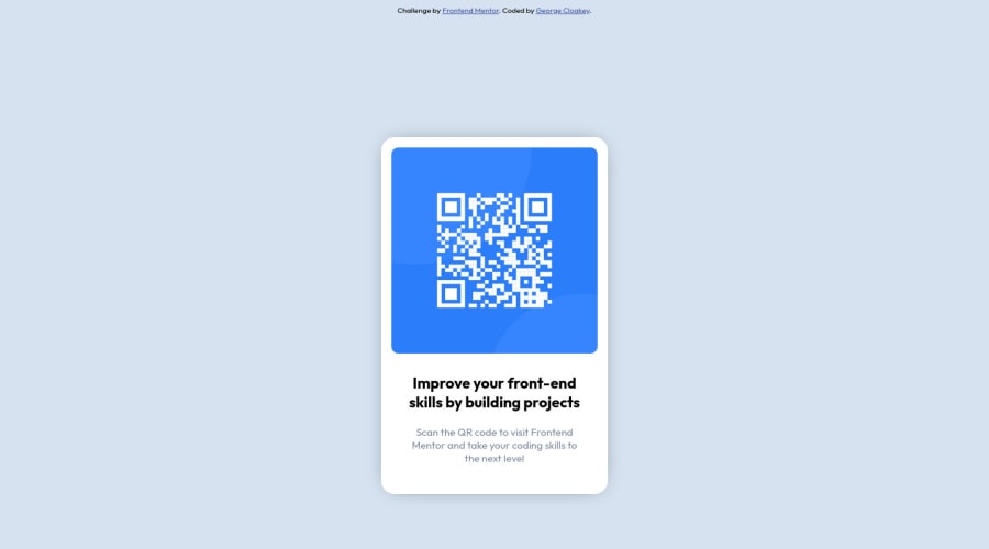
Design comparison
Community feedback
- @VCaramesPosted almost 2 years ago
Hey there! 👋 Congrats on completing your first challenge!🎊🍻
Here are some suggestions to help improve your code:
- The "Improve your front-end skill by building projects" is a heading ⚠️ in this component, so should be wrapped in an heading element.
- Change
widthtomax-widthin your component’s container to make it responsive. You will also want to remove theheightas it is unnecessary.
- Change
widthtomax-width: 100%in your image to make it responsive. You will also want to remove theheightas it is unnecessary.
If you have any questions or need further clarification, feel free to reach out to me.
Happy Coding! 🎆🎊🪅
Marked as helpful0 - @MelvinAguilarPosted almost 2 years ago
Hello there 👋. Congratulations on completing your first challenge! You have done a great job and I can see you are on the right track.
I have some suggestions about your code that might interest you.
HTML 📄:
- Use the
<main>tag to wrap all the main content of the page instead of the<div>tag. With this semantic element you can improve the accessibility of your page.
- Use the
<footer>tag to wrap the footer of the page instead of the<div class="attribution">. The<footer>element contains information about the author of the page, the copyright, and other legal information.
- You must use a level-one heading (h1) even though this is not a full-page challenge. You can create an '<h1>' element within your 'main' element that will be hidden visually but visible and readable by screen readers. The class "sr-only" hides content visually and here are the styles to copy. e.g.:
<h1 class="sr-only">QR Card Component</h1>
Alt text 📷:
-
The
altattribute should explain the purpose of the image. Uppon scanning the QR code, the user will be redirected to the frontendmentor.io website, so a betteraltattribute would beQR code to frontendmentor.ioIf you want to learn more about the
altattribute, you can read this article. 📘.
CSS 🎨:
-
Why did you use position: absolute to center the component, if you had already used flexbox on the body element?. Centering an element with
position: absolutewould make your element behave strangely on some screen sizes. To center an element with flexbox, you must set a height to the container and set the direction of how the elements are placed with flex-direction.body { background-color: hsl(212, 45%, 89%); display: flex; align-items: center; justify-content: center; font-family: 'Outfit', sans-serif; min-height: 100vh; flex-direction: column; } .card { /* position: absolute; */ /* top: 25%; */ }
- Instead of using pixels in font-size, use relative units like
emorrem. The font-size in absolute units like pixels does not scale with the user's browser settings. This can cause accessibility issues for users who have set their browser to use a larger font size. You can read more about this here 📘.
-
You should use a CSS reset to remove the default browser styles and make your page look the same in all browsers.
Popular CSS resets:
I hope you find it useful! 😄 Above all, the solution you submitted is great!
Happy coding!
Marked as helpful0 - Use the
Please log in to post a comment
Log in with GitHubJoin our Discord community
Join thousands of Frontend Mentor community members taking the challenges, sharing resources, helping each other, and chatting about all things front-end!
Join our Discord
