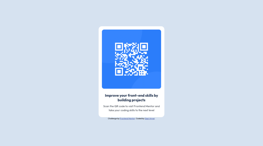
I HOPE YOU GUYS LIKE MY WORK , I THINK THERE SOMETHING THAT I MISSING
Design comparison
Solution retrospective
Finally done it
Community feedback
- @chrisjay358Posted almost 2 years ago
Hi Qazi Aimal, you did fine work, congrats on that.
- My contribution is that you should add a margin-bottom to the container class in order to give a visual hierarchy to the attribution class.
- You can also use an
<article> instead of a <div>
for semantics
Above that, it is great work you go there, keep doing you.
Marked as helpful1@aimal-qaziPosted almost 2 years ago@chrisjay358 Thanks for the information and feedback
0 - @aa1659Posted almost 2 years ago
Pls how do I submit my work.
0@aimal-qaziPosted almost 2 years ago@aa1659 Go to your profile and then click on submit solution in the submit solution tab select your challenge and submit it I hope this will solve your problem
0 - @lawlawsonPosted almost 2 years ago
Hey!
Great job on this challenge :-)
If you want to take it a step further have a look at the feedback given on the accessibility report, there a couple of small changes you could make to the HTML to improve accessibility. The links are super useful, but if in doubt you can always look at other solutions (like mine) and see how it differs from yours and consider any changes you would make.
Well done!
0
Please log in to post a comment
Log in with GitHubJoin our Discord community
Join thousands of Frontend Mentor community members taking the challenges, sharing resources, helping each other, and chatting about all things front-end!
Join our Discord