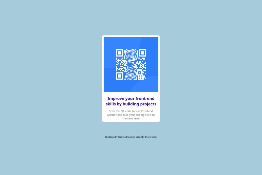


Design comparison

Solution retrospective
finally attempting to solve the challenge
What challenges did you encounter, and how did you overcome them?the challenge gave me quite a tough time with alignment
What specific areas of your project would you like help with?the challenge brief states that responsiveness for mobile screen is not needed, however i am still unable to get how to solve that problem without giving media queries in the responsiveness of my solution
Community feedback
- P@lia-oliveiraPosted 4 months ago
In this specific project, I think it would be a good idea to remove the width: 100% from the universal selector (*). Declaring a height of 100% for the body and html is enough to apply Flexbox and center the content.
You also missed setting the max-width for the card. Without it, the card will keep growing along with the screen size. The width is available in the Figma file. Here’s how it would look with the changes:
* { font-family: 'Segoe UI', Tahoma, Geneva, Verdana, sans-serif; box-sizing: border-box; } html, body { height: 100%; } body { background-color: rgb(166, 204, 219); display: flex; flex-direction: column; justify-content: center; align-items: center; } main { max-width: 20rem; /*320px*/ padding: 1rem; }0@IfeoluranmiPosted 4 months ago@lia-oliveira thanks so much for the feedback and suggestion, will try it out and make improvement
1

Please log in to post a comment
Log in with GitHub
Join our Discord community
Join thousands of Frontend Mentor community members taking the challenges, sharing resources, helping each other, and chatting about all things front-end!
Join our Discord