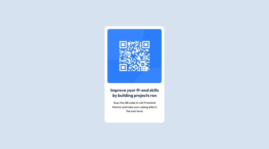
Design comparison
Solution retrospective
This is my first project. But I submit it secondly. Anyway if you want to write feedback you can do.
Community feedback
- @danielmrz-devPosted 11 months ago
Hello @ArafAfif!
Your solution looks great!
I already commented on one of your projects, but since the suggestions I have are the same, I'm gonna just repeat it, just in case you didn't see the other one:
I have a couple of suggestions for improvement:
- In order to make your HTML code more semantic, and since that is the main title of the screen, replace the
<h4>with<h1>. Unlike what most people think, it's not just about the size and weight of the text.
The
<h1>to<h6>tags are used to define HTML headings.<h1>defines the most important heading.<h6>defines the least important heading. Only use one<h1>per page - this should represent the main heading/subject for the whole page. Also, do not skip heading levels - start with<h1>, then use<h2>, and so on.- Also, still about semantic HTML, replace your
div.cardwithmain.card.
All these tag changes may have little or no visual impact but they make your HTML code more semantic and improve SEO optimization as well as the accessibility of your project.
I hope it helps!
Other than that, great job!
Marked as helpful0@ArafAfifPosted 11 months ago@danielmrz-dev Many many thanks for your suggestion. I will replace it. Also thanks for commented my other project.
0 - In order to make your HTML code more semantic, and since that is the main title of the screen, replace the
Please log in to post a comment
Log in with GitHubJoin our Discord community
Join thousands of Frontend Mentor community members taking the challenges, sharing resources, helping each other, and chatting about all things front-end!
Join our Discord
