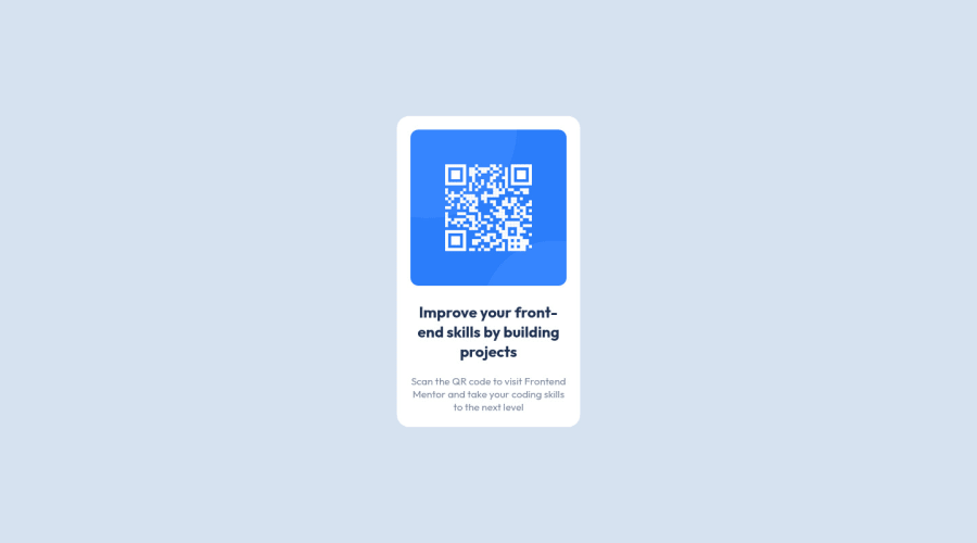
Design comparison
Community feedback
- @malek-btPosted almost 2 years ago
Hey !, how are you ? I really liked the result of your project, but I have some tips that I think you will enjoy:
*Move the class container to the <main> tag to fix the accessibility issue.
*The <img> alt attribute is used to specify the alternate text for an image. It is useful when the image is not displayed. It is used to give alternative information for an image.So make sure to make it not empty.
*Delete the comment at the index.html file.
*Instead of using pixels in font size, use relative units of measure like rem or em. The font size in absolute length units (px) does not allow users with limited vision to change the text size in some browsers.
The rest is good, I hope those tips will help you! 👍
Marked as helpful2@AcdbbPosted almost 2 years ago@malek-bt Thank you for the tips! Will use these tips from now on.
1 - @MelvinAguilarPosted almost 2 years ago
Hi there 👋. Good job on completing the challenge ! I have some feedback for you if you want to improve your code.
HTML:
- Use the
<main>tag to wrap all the main content of the page instead of the<div>tag. With this semantic element you can improve the accessibility of your page.
- Use the
<footer>tag to wrap the footer of the page instead of the<div class="attribution">. The<footer>element contains information about the author of the page, the copyright, and other legal information.
- You must use a level-one heading (h1) even though this is not a full-page challenge. You can create an '<h1>' element within your 'main' element that will be hidden visually but visible and readable by screen readers. The class "sr-only" hides content visually and here are the styles to copy. e.g.:
<h1 class="sr-only">QR Card Component</h1>
- Since this component involves scanning the QR code, the image is not a decoration, so it must have an
altattribute. Thealtattribute should explain its purpose. e.g.QR code to frontendmentor.io
CSS:
- Instead of using pixels in font-size, use relative units like
emorrem. The font-size in absolute units like pixels does not scale with the user's browser settings. This can cause accessibility issues for users who have set their browser to use a larger font size. You can read more about this here.
I hope you find it useful! 😄 Above all, the solution you submitted is great!
Happy coding!
Marked as helpful1@AcdbbPosted almost 2 years ago@MelvinAguilar Thank you for the feedback. I'll incorporate the suggested changes in my code.
1 - Use the
Please log in to post a comment
Log in with GitHubJoin our Discord community
Join thousands of Frontend Mentor community members taking the challenges, sharing resources, helping each other, and chatting about all things front-end!
Join our Discord
