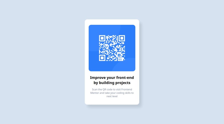
Design comparison
Community feedback
- @rayaattaPosted 10 months ago
Hello PARVATHISOMASUNDARAM👋, congratulations on completing your first FED challenge 🎉
I have some suggestions you might find useful.
1 Try to make your html more Semantic by wrapping the main page content inside a
<main>tag . Replace<div class="card">With<main class="card">. This changes nothing visually but Using it makes all the difference. Using semantic markup improvesSEO
And user experience (accessibility) for people using assistive technology such as screen readers.
2 The qr code should have text inside an alt attribute stating what it is and where it leads i.e
alt="qr code leading to frontendmentor.io3 I noticed that you used
h2.since it is the only heading in the document you should replace it with<h1>.Here's a quick guide on how to use them:
The
<h1>to<h6>tags are used to define HTML headings.<h1>defines the most important heading.<h6>defines the least important heading. Only use one<h1>per page - this should represent the main heading/subject for the whole page. Also, do not skip heading levels - start with<h1>, then use<h2>, and so on. You can then style them in you css.Unlike what most people think, it's not just about the size and weight of the text It is about maintaining a clear and consistent hierarchy through out the document
I hope this helps 🙃
Otherwise your solution is neat👍
Happy coding ✌️
0
Please log in to post a comment
Log in with GitHubJoin our Discord community
Join thousands of Frontend Mentor community members taking the challenges, sharing resources, helping each other, and chatting about all things front-end!
Join our Discord
