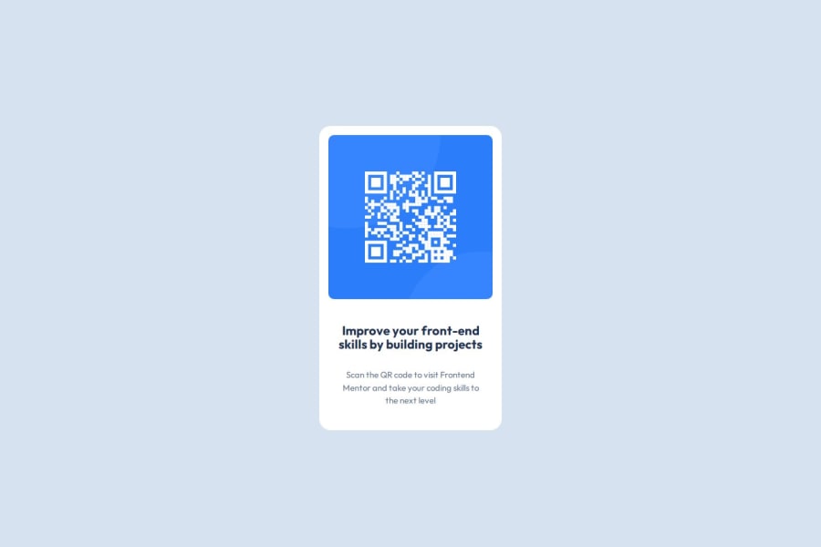
Design comparison
Solution retrospective
Since I already had some prior experience, it wasn't difficult at all which makes sense since its a project designed for people just starting out.
What challenges did you encounter, and how did you overcome them?As it was my first time working with a figma file, i was overwhelmed to say the least & it took me a bit to get comfortable & to actually understand how to use it to look for design dimension ect. I would like to get comfortable with using it from now so i will try my best!
What specific areas of your project would you like help with?it would be helpful if someone could let me know if the HTML I wrote is actually semantically correct or not. Other than that, i am not really sure since its the fundamentals here, but if there is something i did/implemented wrong or if there is an efficient way to do something I'd appreciate if you could let me know!
Community feedback
- @grace-snowPosted 23 days ago
This has a few issues that need correcting before moving on:
- the attribution needs moving out of the component and into a footer landmark after the main landmark.
- get into the habit of including a full modern css reset at the start of the styles in every project you do. Andy Bell has a good one you can look up and use.
- place the background colour on the body, not html. As a general rule you don't need to do any styling at all on html, it's not like an element on the page. The body is like the page you are drawing everything else on.
- for the same reason you shouldn't ever change the width of the body. Leave it to be the full page. So the component can't hit screen edges just add a little padding in px to all sides of the body.
- don't limit the height of elements that contain, including the body or main. Because you've set height 100vh that is a limit, which means content overflows badly at some screen sizes like phone landscape orientation. Instead of height, use min-height so that the element is allowed to grow taller than the screen when it needs to.
- font size must never be in px. Use rem.
- this doesn't need any media query. All the component needs is a single max width in rem. That allows it to grow up to a point but also shrink narrower when it needs to. Once you've made these changes you shouldn't need any media queries.
- for future projects, when you add media queries you should define them in rem or em not px. And you wouldn't ever need one to start as small as 375px (23rem). You'd set the layout to change at the point where there is room for the layout to change which is likely to be much larger than that.
Marked as helpful1@frost3dWavePosted 23 days ago@grace-snow Hello, first of all thank you for writing such a detailed feedback , I really appreciate it.
I updated all the changes as i was told both from you & from discord, but from the generated SS above my solution is a bit bigger now? is that normal or expected..
Also I wanted to ask this, is it okay if the padding/margin/gap/border-radius are in px? Is there a better recommended unit for them too? Or just to keep consistent with the rest of styling we should define them in rem too? Please do let me know.
And once again, Thank you for taking the time to help me improve.
0@grace-snowPosted 22 days ago@frost3dWave it's fine to use px for properties that you dont want to scale along with the user's font size. So if a user has their font size at 200% that equates to 32px. If you wanted the border radius to increase then you'd use rem. But if you wanted it to stay static you'd use px.
Personally I would use px for the card and body padding, and rem for the border radius. But it's really down to what you prefer.
Marked as helpful0 - @gentianbajramiPosted 24 days ago
HTML CSS
0@grace-snowPosted 23 days ago@gentianbajrami why have you commented this? What is it me at to mean or achieve??
0
Please log in to post a comment
Log in with GitHubJoin our Discord community
Join thousands of Frontend Mentor community members taking the challenges, sharing resources, helping each other, and chatting about all things front-end!
Join our Discord