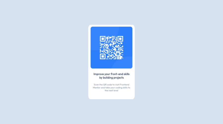
Design comparison
Solution retrospective
Hello! It is my first project on Frontend Mentor and my first project after I finish a tutorial about HTML and CSS. Can someone give a little feedback on this? I know it is not so difficult to do this, but it is my first project and It is means a lot to me if you give me good feedback. Thank you so much for your time!
Community feedback
- @MelvinAguilarPosted about 2 years ago
Hi @dasserban1 👋, good job completing this challenge, and welcome to the Frontend Mentor Community! 🎉
It's a great solution and a good start. Here are a few suggestions I've made that you can consider in the future if you're looking to improve the solution further.
- It's recommended to use the semantic tag main. Click here for more information..
- Add descriptive text to the
alt
attribute of the images. The text must clearly describe the image. The alt attribute enables screen readers to read the information about on-page images and will be displayed instead if an image file cannot load. - Instead of using pixels in font size, use relative units of measure like
rem
orem
. The font size in absolute length units (px) does not allow users with limited vision to change the text size in some browsers. Reference. - Add an h1 tag to your solution. The
<h1>
element is the main heading on a web page. There should only be one<h1>
tag per page, and always avoid skipping heading levels; Always start from<h1>
, followed by<h2>
, and so on up to <h6> (<h1>,<h2>,...,<h6>). The HTML Section Heading elements (Reference)
Solution:
<h1>Improve your front-end skills by building projects</h1>
To improve your solution on mobile devices:
- Use
max-width: 300px
tocard
selector instead of width, this will make the card container a bit responsive on mobile and set the element's maximum width to 300px. - Use
min-height: 480px
tocard
selector instead of height - Use
margin: 0.938rem
ormargin: 15px
in thecard
selector so that it has some space when viewed on mobile devices. - Use
max-width: 250px
to <h3> and <p> elements instead of width, or use instead themargin
attributes so that it has spaces on the sides without usingwidth
.
I hope those tips will help you.
Good job, and happy coding!
Marked as helpful1@dasserban1Posted about 2 years ago@MelvinAguilar Thank you very much for your time and your feedback!
2 - @DQuinaPosted about 2 years ago
Muito bom amigo! Continue trabalhando assim que chegará longe neste mundo da programação! Caso precise de alguma coisa, estou disponível para trocar umas ideias e ajudar : )
2@DQuinaPosted about 2 years ago@dasserban1 How do I make the images appear to me when I load the mentor frontend?
0@dasserban1Posted about 2 years ago@DQuina Please be more specific on what images you want to appear.
1@DQuinaPosted about 2 years ago@dasserban1 If you go to my profile and see my challenges, you will notice that the images do not appear! And what I want to know is how do I make the images appear in the challenge I made
1@dasserban1Posted about 2 years ago@DQuina You must upload your images to GitHub or whatever platform you use for deploying projects.
0@DQuinaPosted about 2 years ago@dasserban1 Eu tenho as imagens carregadas juntamente com os ficheiros index.html / index.css Não estou a conseguir perceber o que falta.
0@dasserban1Posted about 2 years ago@DQuina I think, maybe you don't put correct path to those images in your HTML file. Try to modify them, for example <img src="img_girl.jpg" alt="Girl in a jacket"> modify the src path to your images
0
Please log in to post a comment
Log in with GitHubJoin our Discord community
Join thousands of Frontend Mentor community members taking the challenges, sharing resources, helping each other, and chatting about all things front-end!
Join our Discord