Submitted 5 months ago
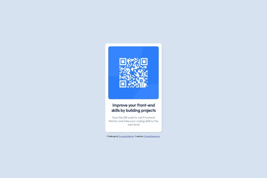
QR Code Component
#accessibility#editor-x#foundation#open-props#nunjucks
@ChantalNgwenya
Design comparison
SolutionDesign
Solution retrospective
What are you most proud of, and what would you do differently next time?
In the QR code component challenge, here's a breakdown of my experience:
What I'm most proud of:- Styling the image: I successfully centered the QR code image using CSS Flexbox, which really helped me understand how to manage layout.
- Linking custom fonts: I learned how to link Google Fonts into the project and apply them using CSS, enhancing the overall design.
- Mobile-first approach: Implementing the mobile-first workflow allowed the page to scale well across different screen sizes, which was new for me and felt like a big win.
- More structured CSS: Next time, I would like to organize my CSS better, perhaps by using a methodology like BEM (Block Element Modifier) to create more maintainable code.
- Additional breakpoints: While I focused on mobile-first design, I realize I could add more media queries to better optimize the layout for tablets and large screens.
- Experiment with CSS Grid: Although I used Flexbox for this project, I would explore CSS Grid more deeply in future projects to see how it compares for complex layouts.
This challenge was a great opportunity to build upon foundational skills, and I’m excited to keep improving.
What challenges did you encounter, and how did you overcome them? Challenges I encountered:-
Centering the QR code component:
- Problem: Initially, I struggled to center the QR code component both vertically and horizontally on the page.
- Solution: I used Flexbox properties (
display: flex;,align-items: center;,justify-content: center;) and set theheightof the body to100vh, which allowed me to align the content perfectly in the middle of the screen.
-
Styling the image:
- Problem: Ensuring the image was responsive while maintaining its aspect ratio was tricky. The image would stretch or not resize properly.
- Solution: I used
width: 100%and set amax-widthfor the container, which ensured that the image scaled properly without distortion.
-
Custom fonts:
- Problem: I had trouble importing and applying a custom font from Google Fonts.
- Solution: After reviewing the documentation and articles, I learned to use the
@importor `` method in the HTML to properly load the font, and applied it withfont-family: 'Outfit', sans-serif;in my CSS.
- I spent time reading documentation and experimenting with different CSS properties to get the layout right.
- I also sought feedback and tips from the developer community, which helped me approach problems from new angles.
- Learning by trial and error, and debugging with browser developer tools, was crucial in overcoming these challenges.
These hurdles were great learning opportunities, pushing me to explore more about layout techniques and responsive design!
What specific areas of your project would you like help with?Here are some specific areas of my project where I'd like help:
-
CSS Optimization:
- I'd love feedback on how to better structure my CSS for readability and maintainability. Are there best practices or methodologies (like BEM) that would be useful for a project like this?
-
Responsive Design:
- While I used a mobile-first approach, I’m unsure if I’ve optimized the design well for larger screens, especially tablets. Any advice on improving responsiveness across multiple breakpoints would be helpful.
-
CSS Grid:
- Although I used Flexbox, I’d like to explore using CSS Grid for more complex layouts in the future. Could someone point me to resources or give advice on when Grid might be better than Flexbox for such projects?
-
Accessibility:
- I want to ensure that my project is accessible to users of all abilities. Are there any accessibility issues that I may have overlooked, and how can I improve that aspect of my code?
These areas are where I’d appreciate feedback or guidance to help me grow as a front-end developer!
Community feedback
Please log in to post a comment
Log in with GitHubJoin our Discord community
Join thousands of Frontend Mentor community members taking the challenges, sharing resources, helping each other, and chatting about all things front-end!
Join our Discord
