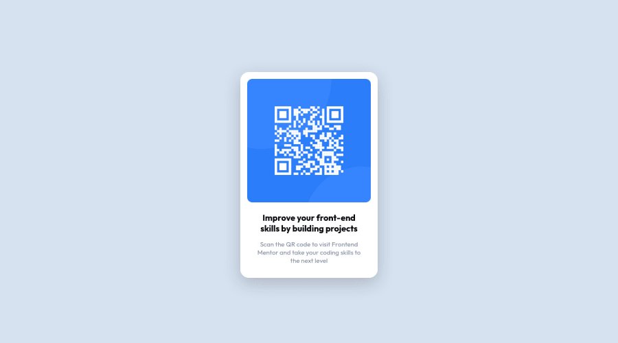
Design comparison
Solution retrospective
Any feedback would be greatly appreciated, Thank you!
Community feedback
- @MelvinAguilarPosted almost 2 years ago
Hello 👋. Congratulation on successfully completing your first challenge 🎉 ! !
I have some recommendations regarding your code that I believe will be of great interest to you.
HTML 📄:
- Wrap the page's whole main content in the
<main>tag.
Alt text 📷:
- The
altattribute should not contain the words "image", "photo", or "picture", because the image tag already conveys that information.
-
The
altattribute should explain the purpose of the image. Uppon scanning the QR code, the user will be redirected to the frontendmentor.io website, so a betteraltattribute would beQR code to frontendmentor.ioIf you want to learn more about the
altattribute, you can read this article. 📘.
CSS 🎨:
-
Setting the font-size to 62.5% can attract compatibility issues with third-party libraries or plugins. You can read more about this with this lectures:
- 1. Should I change the default HTML font-size to 62.5%?.
- 2. The Surprising Truth About Pixels and Accessibility - The 62.5% trick.
- 3. A comment on the 62.5% trick
Credit to grace-snow and vanzasetia for pointing this out.
I hope you find it useful! 😄 Above all, the solution you submitted is great!
Happy coding!
Marked as helpful2 - Wrap the page's whole main content in the
Please log in to post a comment
Log in with GitHubJoin our Discord community
Join thousands of Frontend Mentor community members taking the challenges, sharing resources, helping each other, and chatting about all things front-end!
Join our Discord
