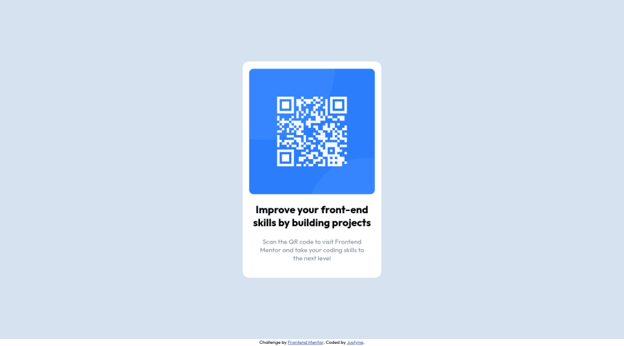
Design comparison
Solution retrospective
I am not sure if this project is written properly. I would like to know what to change in this basics for better future practices.
Community feedback
- @FluffyKasPosted about 2 years ago
Heyo, it looks really good! Few small things to correct here:
- no need for a homepage div, those styles can be applied straight on the body element
- it's best to not set a any width on the body, it takes up a 100% by default and thats what you'll need
- for height, you could set a min-height: 100vh on the body (min-height is always preferred here over height for responsiveness reasons)
- no need to set a fixed height on the card itself: html elements have their own natural height, which you can increase by adding margin, if needed
- for better responsiveness, use max-width instead of width on the card, this way it will resize on smaller screens
Other than these, it looks very much like the original design, so well done! ^^
Marked as helpful2@MayyarZidanePosted about 2 years agoI tried to enhance it a little bit, Can you take a look to the code?@FluffyKas
0@FluffyKasPosted about 2 years ago@MayyarZidane
Sure, I'll leave a comment at your solution
1@JustynaAleksPosted about 2 years agoSo I fixed all these things and sent it on GitHub(it has the same repo and url), but i don't know if it'll update here automatically? @FluffyKas
0@FluffyKasPosted about 2 years ago@JustynaAleks
Yeah, it should update automatically if you deploy with github pages, it might just take some time. ^^
It looks a lot better, the only thing I'd suggest now is to make this image itself responsive too, so it can resize when the screen gets smaller. This could be done like this:
max-width: 100%;
display: block;
margin: 0 auto;
This code snippet works for most images you'll come across so it's nice to remember it.
Marked as helpful0@JustynaAleksPosted about 2 years agoYay! Many, many thanks for your help! :))) I made changes and pushed it on github :) @FluffyKas
0 - @Kl3vaPosted about 2 years ago
Using semantic(main,section) html to avoid something popularly called div soup where you ve divs littered in your code. Also, for styling you would want to adopt relative units(rems,%,vw) and dump absolutes(px), cause they aid in building responsive sites cause they adapt to width/height changes of a screen. Absolutes are generally fixed so they play well when styling something like border-radius.
Marked as helpful1@MayyarZidanePosted about 2 years agoThanks!, I will try this in the next projects.@Kl3va
1@MayyarZidanePosted about 2 years agoI tried to enhance it a little bit, Can you take a look to the code?@Kl3va
0
Please log in to post a comment
Log in with GitHubJoin our Discord community
Join thousands of Frontend Mentor community members taking the challenges, sharing resources, helping each other, and chatting about all things front-end!
Join our Discord
