Design comparison
Solution retrospective
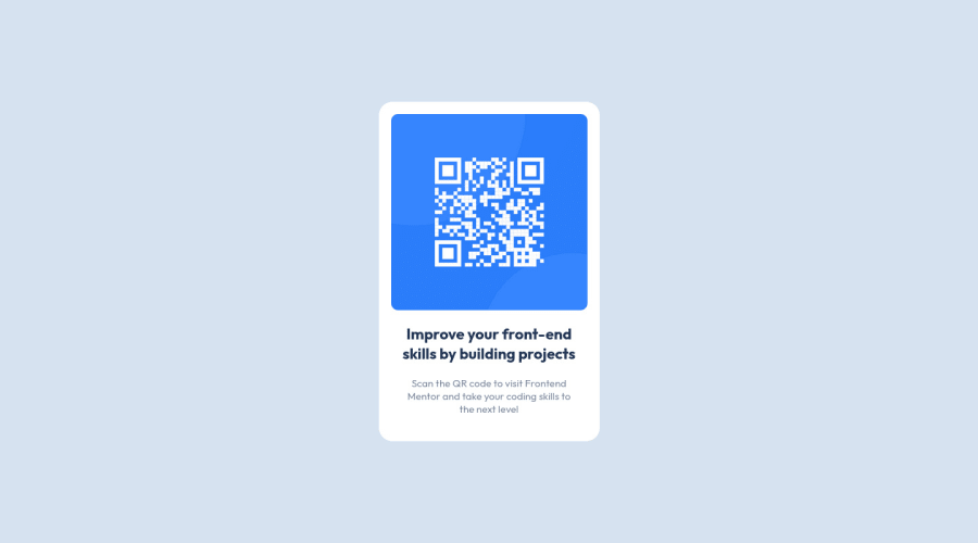
The hardest part I found building this project was whether I should be using grid or flexbox. I ended up using Grid to just position the layout in the center and flexbox for the card container.
Wasn't sure if it was the right way to use grid and flexbox. As i'm still learning and this is my first ever project.
I want to know if what I did was correct or if I should of tackled it in a more efficient way.
Community feedback
- @PekinezerPosted almost 2 years ago
Also one more thing I notices is your github repository, I am not sure what the practice is on Frontend Mentor but usually developers don't push the entire root folder to github, feel free to make use of .gitignore file to mark the folders and files you dont want to be pushed and i dont think you need to push the .gitignore file to github as it is just a list of files and folders... Anytime mate.
Marked as helpful0@JackoWillPosted almost 2 years ago@Pekinezer Okay cool I will keep that in mind for the next one. I just went and removed some files from the root and updated the repo. Im trying to figure out how to use the .gitignore to mark files i don't want to be pushed. How can I do that? I only learnt git and Github a few hours ago so still trying to figure it out. Thanks Josip!
0 - @PekinezerPosted almost 2 years ago
The solution you have done is not bad as far as I can see, although in this perticular case it might be easier to give the body flex then justify-content center and align items center, and if you so desire give the element itself again display flex like you did here, and i think you don't need the width 100% on body because it should be by default the entire screen width... Height you do need. For more complex design's use grid where you need to align item's on the x axis and the y axis at the same time and when you have more elements but in case of centering a single element flex should be an approach that saves you time. Hope it helps.
Marked as helpful0@JackoWillPosted almost 2 years ago@Pekinezer Thank you so much for the tips! I just fixed it up then. Will keep in mind for next time about grid that makes sense. Im a total newbie so really appreciate the feedback! Thanks mate
0
Please log in to post a comment
Log in with GitHubJoin our Discord community
Join thousands of Frontend Mentor community members taking the challenges, sharing resources, helping each other, and chatting about all things front-end!
Join our Discord