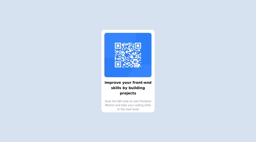
Design comparison
Solution retrospective
Hey Everyone. I have attempted other challenges like the 3 column design, but I suppose I am still not as good as I think. This is my first "real" project. Tell my what you all think!
Community feedback
- @grace-snowPosted almost 2 years ago
Hello
I'm afraid there are some problems in this, partly caused by the reset and partly your code
- Update alt text on img to be capitalised correctly and say where the QR code goes to (add url)
- Font size must never be in px. Use rem (really important!)
- The card should not have a width or height on it. Only a max-width in rem
- The image should not have a width or height in px. Your reset is already setting max width to 100% so you shouldn't need anything, but you can add width 100% if you want
- The card should have padding. It's important to understand the box model (look it up!). Padding is for internal spacing on boxes to keep content from the edges. Margin is for external spacing between elements. The card should have padding. The elements inside should only need vertical margins
- Border radius should be in a fixed unit like px/rem. Using % will create strange radius on non-square items
- On mobile landscape the QR code is actually cut off. I am away from computer so can't check the cause but it's possibly a problem with having height 100% on both the html and body in combination with the grid centering technique.
0 - @HassiaiPosted almost 2 years ago
Use rem or em as unit for the padding, margin, width and preferably rem for the font-size. The rem unit is relative to the browser and can be changed by the user. The em is relative the first font-size that was given em. Both rem and em have a default value of 16px, 1rem/1em=16px; for more on CSS units watch this https://youtu.be/N5wpD9Ov_To
Give the img a max-width of 100% for image to fit where it is placed and be responsive or width of 100% for the image to fit where is placed instead of a fixed width and height value
Hope am helpful.
Well done for completing this challenge. HAPPY CODING
0 - @tarek008Posted almost 2 years ago
Nice work Adam , As i see the layout look good and your code is well-structured, you just need to add some padding to the bottom to make it look perfect
0
Please log in to post a comment
Log in with GitHubJoin our Discord community
Join thousands of Frontend Mentor community members taking the challenges, sharing resources, helping each other, and chatting about all things front-end!
Join our Discord