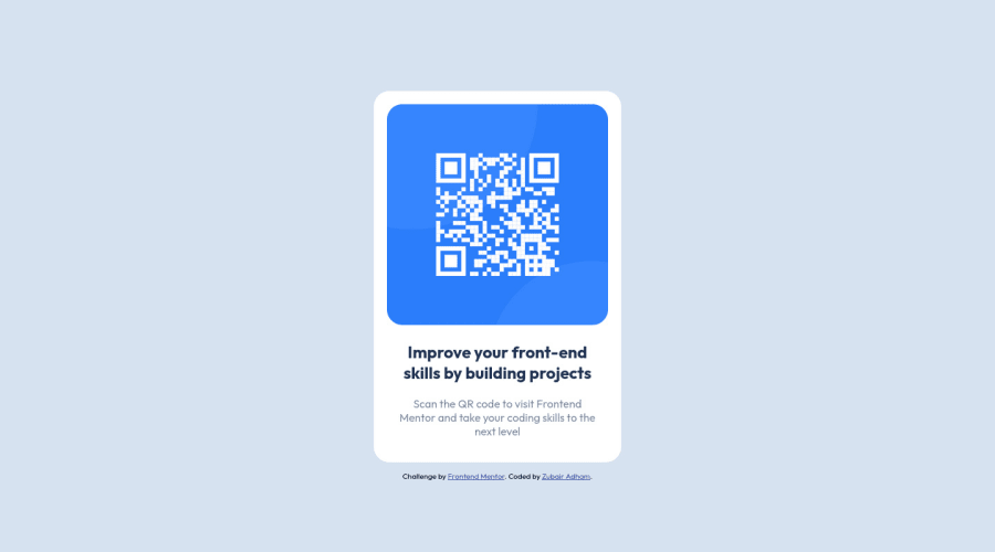
Design comparison
Solution retrospective
I always found it difficult to center element inside a div.
display: flex;
align-items: center;
justify-content: center;
Sometimes this code block would work. But sometimes it fails to center any element. In this particular case, when centering the card container in the main body. I did put the property block above in my parent container but it doesn't work. Did some research and asking for help from other friend, and come up with this solution
body {
display: grid;
place-content: center;
min-height: 100vh;
}
What is the best practice for centering an element inside a div?
In which situation I should use the first code block and the second code block in my code?
Community feedback
- @0xabdulkhaliqPosted over 1 year ago
Hello there ๐. Congratulations on successfully completing the challenge! ๐
- I have other recommendations regarding your code that I believe will be of great interest to you.
HTML ๐ท๏ธ:
- This solution generates accessibility error reports, "All page content should be contained by landmarks" is due to
non-semantic
markup, which lack landmark for a webpage
- So fix it by replacing the
<div class="card-container">
element with the semantic element<main>
along with<div class="attribution">
into a<footer>
element in yourindex.html
file to improve accessibility and organization of your page.
- What is meant by landmark ?, They used to define major sections of your page instead of relying on generic elements like
<div>
or<span>
- They convey the structure of your page. For example, the
<main>
element should include all content directly related to the page's main idea, so there should only be one per page
HEADINGS โ ๏ธ:
- And, this solution has also generated accessibility error report due to lack of level-one heading
<h1>
- Every site must want at least one
h1
element identifying and describing the main content of the page.
- An
h1
heading provides an important navigation point for users of assistive technologies, allowing them to easily find the main content of the page.
- So we want to add a level-one heading to improve accessibility by reading aloud the heading by screen readers, you can achieve this by adding a
sr-only
class to hide it from visual users (it will be useful for visually impaired users)
.
I hope you find this helpful ๐ Above all, the solution you submitted is great !
Happy coding!
Marked as helpful1@atmahanaPosted over 1 year ago@0xAbdulKhalid Hi! Thank you for your feedback. I didn't know that landmarks plays such an important role for a webpage that it will improves accessibility. And also I thought we can just skip the heading to other level without having any
h1
, but turns out it didn't work that way haha.There is absolutely so much more for me to learn and I will take your suggestions into account. Thank you so much for the insights and new knowledges!
0 - @PipouwPieuwPosted over 1 year ago
Hello and well done completing this challenge!
To answer your question, in this case you can use either flexbox or grid. I don't think there is any good practice that makes one of these better than the other.
Flexbox didn't work in your example because you also need to make sure that your element's height is at least equal to the window's height, as you did in your grid example. Adding
min-height: 100vh
should work. You would also need to setflex-direction: column
in this case because of the.attribution
element being a sibling of.card-container
:body { display: flex; align-items: center; justify-content: center; flex-direction: column; min-height: 100vh; }
Hope this helps. Keep coding :)
Marked as helpful1@atmahanaPosted over 1 year ago@PipouwPieuw Hi! Thank you for your feedback. I didn't thought that
min-height: 100vh
will fix the issue. I will keep that in mind whenever I encounter the same problem.0 - @rfcho322Posted over 1 year ago
Hi Zubair Adham, congratulations on completing the challenge
- This block of code is working, it should center vertically and horizontally, you just can't see it because the container where you use this is not taking the full height of its parent.
display: flex; align-items: center; justify-content: center;
- This is one is working because you specified a height
body { display: grid; place-content: center; min-height: 100vh; }
- In order for flex to work, so, on your card-container class, do this instead
body{ height: 100vh; } .card-container { min-height: 100vh; display: flex; justify-content: center; align-items: center; }
Marked as helpful1@atmahanaPosted over 1 year ago@rfcho322 Hi! Thank you for the time to provide me some feedback. I will remember to set the
min-height
for the flex parent container.0 - @0xabdulPosted over 1 year ago
Hello Front end Mentor Member well you successfully completed the QR code component
- A Few line of suggestions for improve your code
- In Html๐ :
- HEADING โ ๏ธ
- The html document must be included level of headings like <h1> <h3> <h3> ect we use the header line by line or sequence
- Ex :
<body> <h1> Improve your front-end skills by building projects </h1> <p> Scan the QR code to visit Frontend Mentor and take your coding skills to the next level </p>
- LANDMARK ๐
- The main landmark should be a top-level landmark. When a page contains nested document and/or application roles (e.g. typically through the use of iframe and frame elements), each document or application role may have one main landmark. If a page includes more than one main landmark, each should have a unique label.
- To Clear the Accessibility reports use the Semantic elements Or non - Semantic elements
- Note This Elements are don't sikp
- semantic elements :
<aside> , <artical> , <main>, <header> ,<section><footer>, <form> ect..
- non- semantic elements :
<div> , <span> ect ...
- for easy way to clear the Accessibility reports using non semantic elements Ex :
<body> <div class="container" role="main"> /html code goes here : ๐ </div> </body>
- Or
- using semantic elements
- Ex :
<header> should be put heading or logo๐ธ </header> <nav> //Links here </nav> <main> Main of the contents ๐ </main> <footer> ยฉcopy right here๐ </footer>
- I Hope you find the solution and it's useful for you and your project is great Happy Coding Member
Marked as helpful1@atmahanaPosted over 1 year ago@0xAbdul Hi! Thank you for providing the suggestions and solutions! I will take into consideration to write code with better accessibility for users.
0 - @atif-devPosted over 1 year ago
Hi Zubair, congrats๐ on completing the challenge. Better take care about following points.
- The code block that you have mentioned is BEST as long as you have a component inside a body and you want it to be centered. This source has different methods for centering in case you want to explore further.
- To avoid accessibility issue "All page content should be contained by landmarks" use code as :
<body> <main> ---your code here---- </main> <footer> </footer> </body>
(why
main
matters? Read here)Hope you will find this Feedback Helpful.
Marked as helpful1@atmahanaPosted over 1 year ago@atif-dev Hi! Thank you for providing great reading source regarding my concern. It is indeed helpful for my frontend journey.
1
Please log in to post a comment
Log in with GitHubJoin our Discord community
Join thousands of Frontend Mentor community members taking the challenges, sharing resources, helping each other, and chatting about all things front-end!
Join our Discord