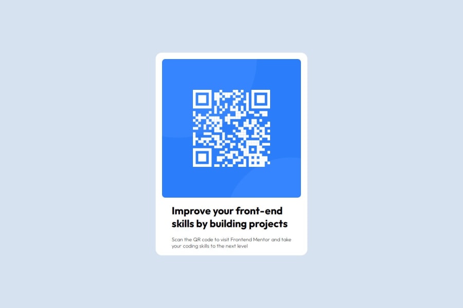
Design comparison
SolutionDesign
Community feedback
- @nelpopuliPosted 4 months ago
- The card width should be fixed, as the current use of
vwmakes it less consistent across screen sizes. A fixed width or usingrem/emwould be more reliable. - The font color and
h1color don’t match the sample design.
Nice job overall! Just a couple of adjustments needed for a closer match to the design.
0 - The card width should be fixed, as the current use of
Please log in to post a comment
Log in with GitHubJoin our Discord community
Join thousands of Frontend Mentor community members taking the challenges, sharing resources, helping each other, and chatting about all things front-end!
Join our Discord
