Design comparison
Community feedback
- @Kamlesh0007Posted almost 2 years ago
Congratulations on completing the challenge🎉! That's a great achievement, and I'm sure you put a lot of effort into it. I really liked the way you approached the challenge and the code you wrote. You demonstrated a good understanding of the concepts and applied them effectively to solve the problem.I have a few suggestions to improve your code further. You need to add Semantic HTML tags
The HTML structure should be semantically correct. The current structure doesn't provide any semantic information about the content. A better approach would be to use appropriate HTML tags such as <header>, <main>, <section>, <article>, etc. to define the sections of the page.<main> tag to indicate that it represents the main content of the page. You can wrap up .attribution class within
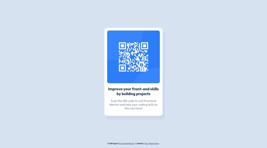
<footer>as a part of semantics.Wrapping the .attribution class within a <footer> element is a great way to improve the semantics and structure of your code. here is the code that u need to add to include semantic tags in ur page<main> <div class="container"> <div class="card"> <img src="./images/image-qr-code.png" alt="QR Code" class="qrcode"> <h2>Improve your front-end skills by building projects</h2> <p>Scan the QR code to visit Frontend Mentor and take your coding skills to the next level</p> </div> </div> </main> <footer> <div class="attribution"> Challenge by <a href="https://www.frontendmentor.io?ref=challenge" target="_blank">Frontend Mentor</a>. Coded by <a href="#">Your Name Here</a>. </div> </footer>0
Please log in to post a comment
Log in with GitHubJoin our Discord community
Join thousands of Frontend Mentor community members taking the challenges, sharing resources, helping each other, and chatting about all things front-end!
Join our Discord
