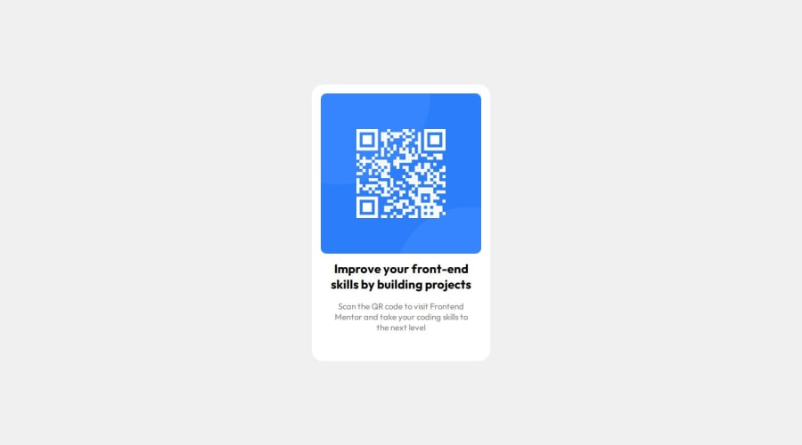
Design comparison
SolutionDesign
Solution retrospective
What are you most proud of, and what would you do differently next time?
I would try using CSS flexbox and grids next time.
What challenges did you encounter, and how did you overcome them?Was stuck for a while with a typo in importing the font
What specific areas of your project would you like help with?Knowing how to correctly determine distance between two components in figma
Community feedback
Please log in to post a comment
Log in with GitHubJoin our Discord community
Join thousands of Frontend Mentor community members taking the challenges, sharing resources, helping each other, and chatting about all things front-end!
Join our Discord
