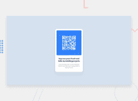
Design comparison
Community feedback
- @MelvinAguilarPosted almost 2 years ago
Hello there 👋. Congratulations on completing your first challenge! You have done a great job and I can see you are on the right track.
I have some suggestions about your code that might interest you.
HTML 📄:
- Use the
<main>tag to wrap all the main content of the page instead of the<div>tag. With this semantic element you can improve the accessibility of your page.
- Use the
<footer>tag to wrap the footer of the page instead of the<div class="attribution">. The<footer>element contains information about the author of the page, the copyright, and other legal information.
Alt text 📷:
- The
altattribute should not contain underscores or hyphens, it must be human readable and understandable.
-
The
altattribute should explain the purpose of the image. Uppon scanning the QR code, the user will be redirected to the frontendmentor.io website, so a betteraltattribute would beQR code to frontendmentor.ioIf you want to learn more about the
altattribute, you can read this article. 📘.
CSS 🎨:
- Instead of using pixels in font-size, use relative units like
emorrem. The font-size in absolute units like pixels does not scale with the user's browser settings. This can cause accessibility issues for users who have set their browser to use a larger font size. You can read more about this here 📘.
- The
width: 100%property in thebodytag is not necessary. Thebodytag is a block element and it will take the full width of the page by default.
- Centering an element with
position: absolutewould make your element behave strangely on some screen sizes, "there's a chance the content will grow to overflow the parent". You can use Flexbox or Grid to center your element. You can read more about centering in CSS here 📘.
I hope you find it useful! 😄 Above all, the solution you submitted is great!
Happy coding!
Marked as helpful1@lepamoorePosted almost 2 years ago@MelvinAguilar Wow thank you for the fast and awesome feedback. I really appreciate that. This is really helpful for me. Thanks!
0 - Use the
Please log in to post a comment
Log in with GitHubJoin our Discord community
Join thousands of Frontend Mentor community members taking the challenges, sharing resources, helping each other, and chatting about all things front-end!
Join our Discord

