Design comparison
Solution retrospective
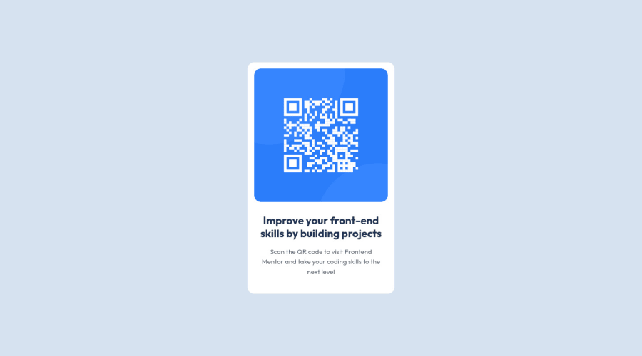
Hello!This is my code for the qr code component.If anyone has some suggestions to make my code 'cleaner' and more responsive I would really like to hear your opinion. ;)
Community feedback
- @faha1999Posted about 2 years ago
Hello, RobicaCodeaza Congratulations on finishing this project. It's lovely and great on the whole! Just a little tip:
- You might want to use semantic tags like the
<main>
to wrap your code, instead ofdiv
. like
<main class="container"> <div class="qr-preview"></div> </main>
You could also make use of
<section>
and/or<article>
semantic tags. This would help improve accessibility.-
add
justify-content: center;
to thebody,
it will center everything. -
remove
margin: 0 auto;
from.container
. it is not necessary anymore. -
I saw in the
style.css
that sometimes you usepx
&rem
. To optimize your speed when resizing fonts for various displays and devices, substituterem
orem
rather thanpx
. These components work better to improve the accessibility of your website.REM
applies to all sizes, not just the font size.
I hope it will work. Happy coding.
Marked as helpful1@RobicaCodeazaPosted about 2 years ago@faha1999 Thank you for your time.Just to make sure i understood the part that was about rem|em|px.Were you suggesting that i should use rem/em across entire style.css?...:)
0 - You might want to use semantic tags like the
- @correlucasPosted about 2 years ago
๐พHi @RobicaCodeaza, congratulations on your first solution!๐ Welcome to the Frontend Mentor Coding Community!
Great solution and a great start! From what I saw youโre on the right track. Iโve few suggestions for you that you can consider adding to your code:
1.Replace the
<h3>
containing the main title with<h1>
note that this title is the main heading for this page and every page needs one h1 to show which is the most important heading. Use the sequence h1 h2 h3 h4 h5 to show the hierarchy of your titles in the level of importance, never jump a level.2.Clean your code by removing some unnecessary divs, most of the content can stand alone without a div. Use div only for blocks that need a special alignment or the content needs a special positioning.
3.Something that can be a time saver for you is to use a CSS RESET to remove all default settings for margins, making the images easier to work, see the article below where you can copy and paste this CSS code cheatsheet: https://piccalil.li/blog/a-modern-css-reset/
โ๏ธ I hope this helps you and happy coding!
Marked as helpful0
Please log in to post a comment
Log in with GitHubJoin our Discord community
Join thousands of Frontend Mentor community members taking the challenges, sharing resources, helping each other, and chatting about all things front-end!
Join our Discord