Design comparison
Solution retrospective
Every type of comments are appreciated.😁
Community feedback
- @NaveenGumastePosted almost 3 years ago
Hay ! Good Job
These below mentioned tricks will help you remove any Accessibility Issues
-> Add Main tag after body like it should be your container
-> For 1st heading or h1 tag, use header tag and then inside the header put your h1 or h2 etc
-> But use header tag only once in main heading element.
Keep up the good work!
Marked as helpful2 - @HugoPadillaPosted almost 3 years ago
Hi @dev-k1, you are doing a great job!
I quite like the result. The css code looks pretty clean to me.
I share with you some suggestions:
- Try as much as possible to structure your HTML with semantic tags and try to use div when you don't have an HTML tag that represents what you want to layout.
Here is an article to learn more about the importance of semantic structuring. Read the article here
Marked as helpful1 - Account deleted
Hi there 👋
Congratulate on finishing your project 🎉. The design looks beautiful 😃.
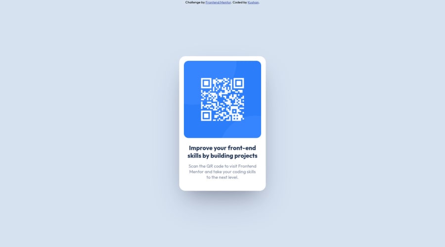
Your card box-shadow does not look like in original design 🤔.
box-shadow: rgb(255 255 255 / 10%) 0px 10px 20px;use can use this code and done ✅Happy coding ☕
1
Please log in to post a comment
Log in with GitHubJoin our Discord community
Join thousands of Frontend Mentor community members taking the challenges, sharing resources, helping each other, and chatting about all things front-end!
Join our Discord
