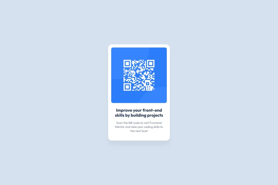
Design comparison
Solution retrospective
OK, 2nd try at this challenge. I think I have a better understanding of some of the concepts and what the challenges require.
Community feedback
- @correlucasPosted over 2 years ago
👾Hello Dan, congratulations for your new solution!
You've reached a level of perfection in the second attempt, the card is beautiful, the design elements match and is super responsive. Congrats!
You can improve it even more, wrapping everything with a single div, no need for more divs, use the main div to wrap everything (img, h1 and p). Replace the h2 with h1and and use rem or em over pixels for a better performance between different screen sizes. Boom, perfect solution!
👋 I hope this helps you and happy coding!
0 - @sinjin25Posted over 2 years ago
Good job, you're really close to perfect.
It looks like the design has slightly more padding and the title text is blue.
Your font-size is a little too big.
One trick I like to use is counting how many words are on the last line of the text. For instance, in the design the last line is "next level" while yours is "the next level" which tells you that your font-size isn't quite right. This doesn't always work but is easier to do than eyeballing it.
0
Please log in to post a comment
Log in with GitHubJoin our Discord community
Join thousands of Frontend Mentor community members taking the challenges, sharing resources, helping each other, and chatting about all things front-end!
Join our Discord
