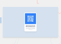
Design comparison
Solution retrospective
That was my first project developed, I would love some tips on how I could improve. In this first part I did not apply concepts of responsiveness, but it is something that I intend to work on in the next
Community feedback
- @fatlindshehuPosted over 2 years ago
Hi,
The component looks great, even though I would suggest avoiding the use of margin to center the container, instead I would recommend using flexbox to center it, I think u did nice using max-width instead of width & I would replace px with rems or ems, in this kind of projects it seems fine but in bigger ones px can cause unexpected issues so it’s better to avoid them!
Either way, great work and keep it up ✌️
Marked as helpful1 - @correlucasPosted about 2 years ago
👾Oi de novo Maria Luisa , tudo bem? Parabéns pelo desafio!
Sua solução ficou perfeita, até a estrutura html ta mto limpa, vc so tem que mudar duas coisas, o alinhamento e trocar o
ppor umh1no titulo principal.Pra alinhar, a primeira coisa que você tem que fazer é adicionar algumas propriedades pro body, primeiro adicionamos
display: flexeflex-direction: columnpra alinhar tudo na vertical. Depois adicionemin-height: 100vh(isso vai fazer com que o body tenha 100% da tela como tamanho) e com isso o elemento filho (no caso o container) vai se alinhar ao tamanho dele, no caso 100% da tela, dessa forma ele ficará centralizado, entendeu?body { background-color: hsl(212, 45%, 89%); text-align: center; font-family: Outfit; font-size: 15px; color: hsl(220, 15%, 55%); min-height: 100vh; display: flex; align-items: center; justify-content: center; }👋 Espero ter ajudado e continue no foco!
Marked as helpful0
Please log in to post a comment
Log in with GitHubJoin our Discord community
Join thousands of Frontend Mentor community members taking the challenges, sharing resources, helping each other, and chatting about all things front-end!
Join our Discord

