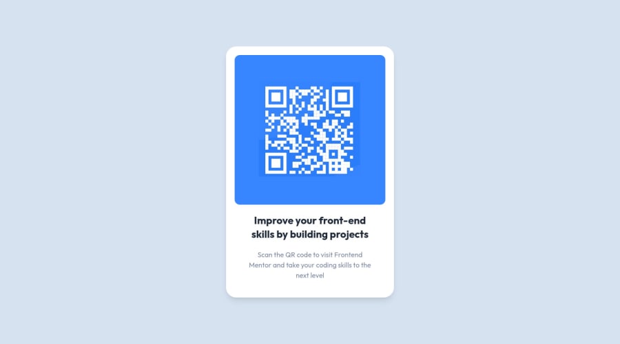
QRCode card for reading. Fully responsive using ReactJS and TailwindCS
Design comparison
Community feedback
- @MelvinAguilarPosted almost 2 years ago
Hello there 👋. Congratulations on completing this challenge!.
I have one suggestion about your code that might interest you.
-
Using
h-screen(height: 100vh) to center the element can cause problems with the layout of the page on smaller screens, such as in landscape view on a mobile device.On smaller screens, such as in landscape view on a mobile device, the height of the viewport may be less than the height of the content of the page. In this case, using height: 100vh for the body element will cause the content of the page to be hidden behind the body element.
Here is an image of how it would look on a mobile device (taking into account the scroll): FireShot Capture - Vite + React + TS - qr-code-component-main-three-henna vercel app
To avoid this problem, it is generally recommended to use
min-h-screen(min-height: 100vh) instead ofh-screen. This will ensure that the content of the page is always visible.
I hope you find it useful! 😄 Above all, the solution you submitted is great!
Happy coding!
2@LucasDinizAlmeidaPosted almost 2 years ago@MelvinAguilar Okay, thanks a lot for the suggestion. I will use it going forward.
0 -
Please log in to post a comment
Log in with GitHubJoin our Discord community
Join thousands of Frontend Mentor community members taking the challenges, sharing resources, helping each other, and chatting about all things front-end!
Join our Discord
