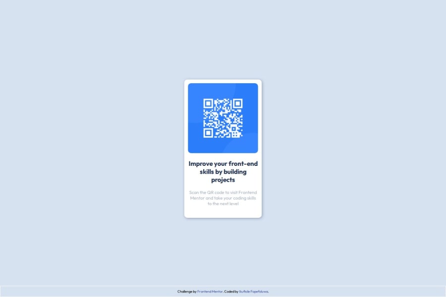
Design comparison
Community feedback
- @MichaelDAbadJrPosted 3 months ago
You did good, it looks very similar to the design. I see you struggled with the same stuff I struggled with. Such as getting the exact spacing, font-size, and font-weights to behave exactly in the design in the perspectives of the exact line breaks, and spacing, etc. I noticed you only used one div in your html. I used a different approach and I wrapped the qr-container as it's own div, and the texts as it's own div. I found doing it this way, and then using flexbox allowed me to control the spacings of not just how the text behaved but how the containers holding the text behave as well. It made spacing them between each other and the qr-container much easier and intuitive. I used the measurements straight from the figma design.
Marked as helpful0@FopefoluwaIkufisilePosted 3 months ago@MichaelDAbadJr Thank you, that’s very helpful! I hadn’t even checked the Figma file, but I appreciate your input. I've reviewed your solution and now understand what you’re referring to. Thank you for the advice!
0
Please log in to post a comment
Log in with GitHubJoin our Discord community
Join thousands of Frontend Mentor community members taking the challenges, sharing resources, helping each other, and chatting about all things front-end!
Join our Discord
