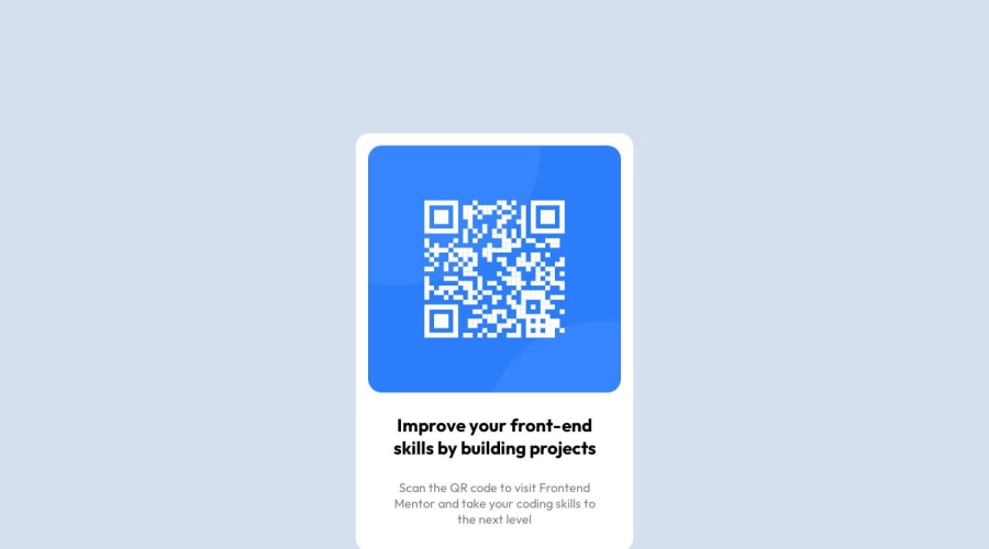
Design comparison
Solution retrospective
Please Give me feedback... What it needs to be improve?
Community feedback
- @OlamideAfunshoPosted over 1 year ago
You could have aligned the container to the center, and I think it's a little bigger than the design. But otherwise, it looks nice.
1 - P@atif-devPosted over 1 year ago
Hi, congrats🎉 on completing the challenge. Better take care about following points.
You must be seeing some accessibility issues, to avoid accessibility issue "All page content should be contained by landmarks" use code as :
<body>
    <main>
        ---your code here----
    </main>
  <footer>
  </footer>
</body>
For better look and centered modify code as:
body {
  background: #d4e0ee;
  margin: 0;
  padding: 0;
  display: grid;
  place-content: center;
  min-height: 100vh;
}
(remove all code inside .container selector)
.qrcomponent {
  width: 300px;
  background-color: white;
  border-radius: 20px;
  text-align: center;
  padding-top: 10px;
}
.qr { border-radius: 20px; width: 91%; }(remove all the code from .textParagraph selector)
.title {
  font-family: Outfit;
  font-size: 20px;
  width: 88%;
  margin: .4em auto;
}
.sub { color: rgb(0, 0, 0, 0.5); text-align: center; font-family: Outfit; font-size: 17px; font-style: normal; font-weight: 400; line-height: normal; width: 89%; margin: 0 auto; padding-bottom: 1em;- In README file of your GitHub project's solution remove already present content and write about your own working flow, findings, new learned things, useful resources, etc.
Hope you will find this Feedback Helpful.
Let's connect for learning📝 and sharing🤝. Twitter , LinkedIn
0
Please log in to post a comment
Log in with GitHubJoin our Discord community
Join thousands of Frontend Mentor community members taking the challenges, sharing resources, helping each other, and chatting about all things front-end!
Join our Discord
