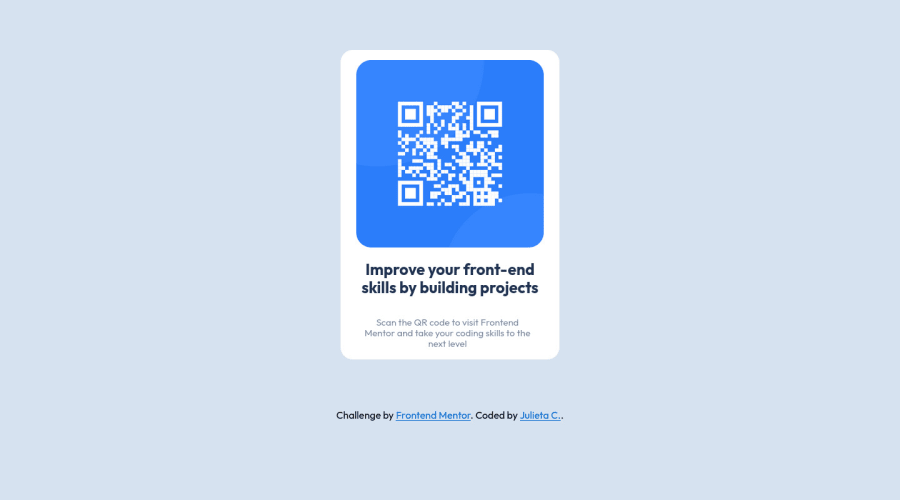
Design comparison
Solution retrospective
First try, it cost me a bit but we did it (I think soo). Do you have any tips??
Thank you in advance!!!
Community feedback
- @Binh2Posted almost 2 years ago
Hey there! 👋 Here are some suggestions to help improve your code:
Congrats on completing your first challenge! 🙌
I have 9 suggestions for you:
- The component is too small on larger screen. I think you should base your design on vh (view height) so the component scale correctly for other screen type.
.container { box-shadow: 10px 10px 20px #bbb; }to add shadow- You don't need CSS flexbox because using <img>, <h1>, <p> tags automatically break line.
- You can do some reset CSS styles. By resetting your styles, you avoid defaulting to the browser’s built-in styles, which differs from browser to browser. 👇
* { margin: 0; padding: 0; box-sizing: border-box; }Because on Chrome, your <h1> tag have a large margin. - You should use
img { width: 80%; }to size your image dynamically depending on parent width. - You should also use the same width for
.container2 { width: 80%; } - For improved accessibility 📈 for your content,
:root { font-size: 16px; }to give a default font-size. And, it is best practice to use rem for your container font-size and other property value. Use em for your elment. Using these units will give the users the ability to scale elements up and down, relative to a set value. - Add alt attribute to <img> tag to improve accessibility for disabled people.
- Replace <div class="container"> with the <main> tag to fix the accessibility issue.
If you have any questions or need further clarification, feel free to reach out to me.
Happy Coding! <3 😊
0 - @vanzasetiaPosted almost 2 years ago
Hi, Julieta! 👋
First, I recommend using a code-formatter. This way, your code base will have a consistent format, which makes it easier to read the code. I suggest using Prettier as your code-formatter.
Prettier · Opinionated Code Formatter
Here are some other suggestions for improvements.
<img>element must have analtattribute. It doesn't matter whether it is a decorative or informative image.- Remove
border-radius: 00.5rem;from the<body>styling. It is not needed. - Remove the two empty
@mediarules. You don't need media queries to make the card responsive. - Never use
pxunit for font sizes. Useremoreminstead. Relative units such asremandemcan adapt when the users change the browser's font size setting. qr-codeis an invalid CSS selector. It is choosing a<qr-code>element which doesn't exist. Do you mean#qr-codeto select<img src="img/image-qr-code.png" id="qr-code">?- Don't use
idselectors for styling. There are two reasons for not using ID’s to style content:- They mess up specificity because they are too high (the most important reason).
- They are unique identifiers. So, they are not reusable on the same page.
- Remove
heightfrom the.container. Let the content inside it controls the height.
I hope this helps. Happy coding! 😄
0
Please log in to post a comment
Log in with GitHubJoin our Discord community
Join thousands of Frontend Mentor community members taking the challenges, sharing resources, helping each other, and chatting about all things front-end!
Join our Discord
