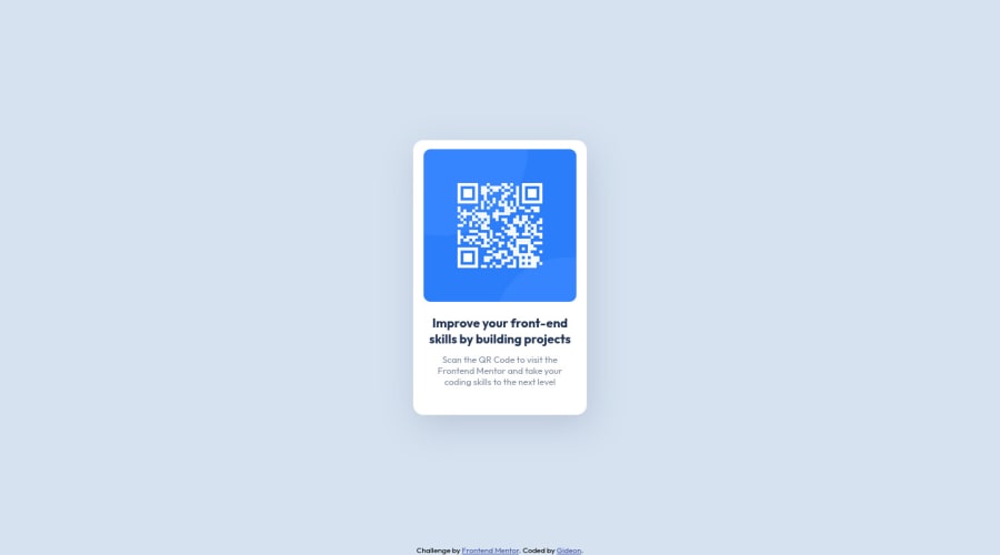
Design comparison
Solution retrospective
All feedbacks are WELCOMED
Community feedback
- @correlucasPosted about 2 years ago
👾Hi @GiDDeRo, congratulations on your first solution!
Great solution and a great start! From what I saw you’re on the right track. I’ve few suggestions for you that you can consider adding to your code:
1.Reduce your code by removing unnecessary elements. The HTML structure is working but you can reduce at least 20% of your code by cleaning the unnecessary elements, you start cleaning it by removing some unnecessary
<div>. For this solution you wrap everything inside a single block of content using<div>or<main>(better option for accessibility) and put inside the whole content<img>/<h1>and<p>.<body> <main> <img src="./images/image-qr-code.png" alt="QR Code Frontend Mentor" > <h1>Improve your front-end skills by building projects</h1> <p>Scan the QR code to visit Frontend Mentor and take your coding skills to the next level</p> </main> </body>2.Replace the
<h4>containing the main title with<h1>note that this title is the main heading for this page and every page needs one h1 to show which is the most important heading. Use the sequence h1 h2 h3 h4 h5 to show the hierarchy of your titles in the level of importance, never jump a level.3.Think about using relative units as
remoreminstead ofpxto improve your performance by resizing fonts between different screens and devices. Anyhow, if we want a more accessible website, then we should use rem instead of px. REM does not just apply to font size, but to all sizes as well.✌️ I hope this helps you and happy coding!
0 - @faha1999Posted about 2 years ago
Hello, Gideon Congratulations on finishing this project. It's lovely and great on the whole! Just a little tip:
- You might want to use semantic tags like the
<main>to wrap your code, instead ofdiv. like
<main class="main-container">
      <div class="img"></div>
</main>

<footer class="attribution">
</footer>
You could also make use of
<section>and/or<article>semantic tags. This would help improve accessibility.- add
justofy-content& alingn-itemsto thebody`
body{ justify-content: center; align-items: center; }- remove
margin: auto;from.main-containerit's not necessary anymore.
I hope it will work. Happy coding.
0 - You might want to use semantic tags like the
Please log in to post a comment
Log in with GitHubJoin our Discord community
Join thousands of Frontend Mentor community members taking the challenges, sharing resources, helping each other, and chatting about all things front-end!
Join our Discord
