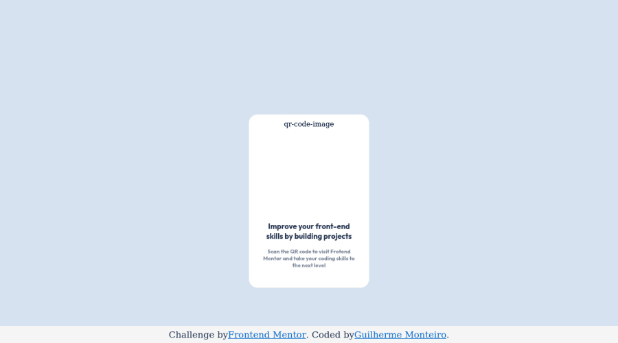
Design comparison
Solution retrospective
1- To put all elements together in the center area. 2- I'm a little concerned about the way i put them in center. 3- I wanna know better ways to do that.
Community feedback
- @MelvinAguilarPosted almost 2 years ago
Hello there π. Good job on completing the challenge !
I have some suggestions about your code that might interest you.
HTML π:
- The text
Improve Your Front-End Skills by Building Projects
is considered a heading element.
Alt text π·:
- The
alt
attribute should not contain underscores or hyphens, it must be human readable and understandable.
- The
alt
attribute should not contain the words "image", "photo", or "picture", because the image tag already conveys that information.
-
The
alt
attribute should explain the purpose of the image. Uppon scanning the QR code, the user will be redirected to the frontendmentor.io website, so a betteralt
attribute would beQR code to frontendmentor.io
If you want to learn more about the
alt
attribute, you can read this article. π.
CSS π¨:
-
To center the component in the page, you should use Flexbox or Grid layout. You can read more about centering in CSS here π.
Flexbox:
body { background-color: hsl(212, 45%, 89%); min-height: 100vh; display: flex; align-items: center; justify-content: center; }
Grid:
body { background-color: hsl(212, 45%, 89%); min-height: 100vh; display: grid; place-content: center; }
In both methods to prevent distortion, you must reduce the margin and set the footer position to left: 0;
.container { /* margin: 16.7rem auto; */ } .attribution { left: 0; }
I hope you find it useful! π Above all, the solution you submitted is great!
Happy coding!
Marked as helpful2 - The text
- @super-gillPosted almost 2 years ago
I think if you take the first forward slash out of the src in the img tag your picture will display, you don't need a slash at the beginning when you're addressing something in the same directory here (you can also do ./ at the start but you don't need to or someone with more knowledge can maybe explain why for this). Don't forget to adjust its width to something, even just 100% so it doesn't spill out of the container.
You centered the project in the same way that I did using flexbox, the other way I know in css without using a library maybe grid or changing the position property and using text alignment, I think flexbox is the best and easiest way for this though.
Marked as helpful2 - @AhmedMahroussPosted almost 2 years ago
good jop my bro Congrats on completing your challenge!ππ»If you have any questions or need further clarification, feel free to reach out to me. Happy Coding! ππ
0
Please log in to post a comment
Log in with GitHubJoin our Discord community
Join thousands of Frontend Mentor community members taking the challenges, sharing resources, helping each other, and chatting about all things front-end!
Join our Discord