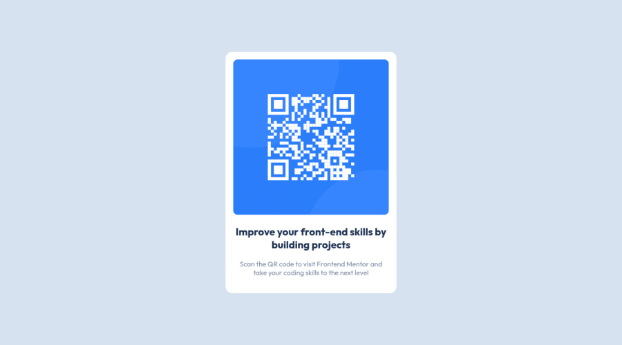
Design comparison
Community feedback
- @romila2003Posted over 2 years ago
Hi Bitu,
Welcome to the frontend mentor community and congratulations for 🎉 for completing your first challenge, the card looks great, and it is great that you used the
flexproperty to center the card. There are some issues/suggestions I want to address:- It is best practice to wrap the main content within the
maintag which would ensure that your content is wrapped within the correct landmarks e.g.<main class="container"></main> - To prevent the card from touching the side of the screen, particularly in mobile screen, you can give your body, a
marginproperty with a value of0 10px
Overall, great attempt and wish you the best for your future projects so keep coding 👍.
0@rauthbituPosted over 2 years ago@romila2003 Thanks you so much .. I will surely implement your suggestions.
1 - It is best practice to wrap the main content within the
Please log in to post a comment
Log in with GitHubJoin our Discord community
Join thousands of Frontend Mentor community members taking the challenges, sharing resources, helping each other, and chatting about all things front-end!
Join our Discord
