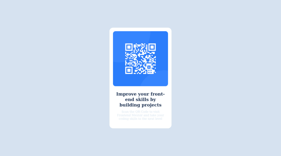
Design comparison
Solution retrospective
My difficult in this project was use the flexbox and grid, because in the early there were the most hard topic i learn.
Community feedback
- @AdrianoEscarabotePosted almost 2 years ago
Hi Eduardo Salazar Jordão de Almeida, how are you? Welcome to the front-end mentor community! I really liked the result of your project, but I have some tips that I think you will enjoy:
As you know this page is just a component, so it doesn't even need an
h1
! because we don't know how important the other components of the site will be! but it's always good to prevent accessibility errors so I think it would be good for you to add anh1
in this component, besides being a good practice for when you are developing larger sites, don't worry forget abouth1
.<h1>Improve your front-end skills by building projects</h1>
Consider using rem for font size .If your web content font sizes are set in absolute units, such as pixels, the user will not be able to re-size the text or control the font size based on their needs. Relative units “stretch” according to the screen size and/or user’s preferred font size, and work on a large range of devices.
if you want to continue coding with px, you can download a very useful extension in vscode, it converts px to rem! link -> px to rem
The rest is great!
I hope it helps... 👍
0@eu-salazarPosted almost 2 years ago@AdrianoEscarabote Man this help me a lot, thanks. In other comentary, I said I didn´t know how to use rem much, but I'm going to practice and my future projects will be better. :)
1@AdrianoEscarabotePosted almost 2 years ago@eu-salazar boaa, usa a extensão man kkkk é bem mais facil do que se acostumar com rem
0 - @TH3RIVPosted almost 2 years ago
Hi, so there's a few things that you could improve on and make this little project a lot better:
- You a
h2
element without having ah1
element. If you are using headings, you start withh1
. Now it doesn't break the page, but is considered bad practice. - I would suggest avoid using
px
for sizing, margins, padding etc. Try usingem
orrem
as much as you can over usingpx
. - Start mobile first and make it look good on mobile before moving onto desktop version. Currently the card is way too narrow on a mobile screen with lots of unused space around it.
Hope this helps!
0@eu-salazarPosted almost 2 years ago@TH3RIV Thanks man. I will pay more attention to these details, especially in sizing. I saw few people using px, so I'll start avoiding it.
0 - You a
Please log in to post a comment
Log in with GitHubJoin our Discord community
Join thousands of Frontend Mentor community members taking the challenges, sharing resources, helping each other, and chatting about all things front-end!
Join our Discord