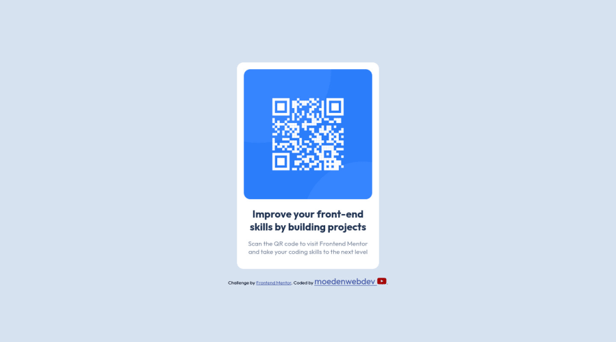
QR_Code_Component with internal CSS ad flex box
Design comparison
Solution retrospective
i have doubt why i am unable to have the border radius for the image at a 4 side which are not equal. what do you think about it. any feed back or suggestion is always welcomed. i have used internal CSS for this challenge. community comment and suggestion motivate me lot . thank you.
Community feedback
- @MelvinAguilarPosted over 2 years ago
Hi there 👋. Good job on completing the challenge ! I have some feedback for you if you want to improve your code.
Regarding your question:
- Usually, images have a bottom margin. To remove it, use
display: blockon the image and it will have the borders the same size
HTML
- Use the
<main>tag to wrap all the main content of the page instead of the<div>tag. With this semantic element you can improve the accessibility of your page.
- Use the
<footer>tag to wrap the footer of the page instead of the<div class="attribution">. The<footer>element contains information about the author of the page, the copyright, and other legal information.
- You must use a level-one heading (h1) even though this is not a full-page challenge. You can create an '<h1>' element within your 'main' element that will be hidden visually but visible and readable by screen readers. The class "sr-only" hides content visually and here are the styles to copy. e.g.:
<h1 class="sr-only">QR Card Component</h1>
- Since this component involves scanning the QR code, the image is not a decoration, so it must have an
altattribute. Thealtattribute should explain its purpose. e.g.QR code to frontendmentor.io
CSS
- You should not use inline-CSS because it is not a good practice. Instead, you should use an external stylesheet to style your page. By doing this, you will be able to have a better organization of your code and will be able to understand it better.
- Instead of using pixels in font-size, use relative units like
emorrem. The font-size in absolute units like pixels does not scale with the user's browser settings. This can cause accessibility issues for users who have set their browser to use a larger font size. You can read more about this here.
Please don't worry if your suggestions are long, they are just details. In the end, the project is well done 👏. Hope you find those tips helpful! 👍
Happy coding! 🎄**
Marked as helpful1@MordenWebDevPosted over 2 years ago@MelvinAguilar hey thanks for the feedback, i have a doubt like you said when i set the image display to block it works fine i get the borders expected . but you said it have margin i tried to set margin of the image to 0 but nothing happened why ? can you explain.
1@MelvinAguilarPosted over 2 years ago@MordenWebDev Since it's not actually a margin,
margin: 0;won't remove it. It just looks like margin. It's actually a white space generated by inline elements of about 3px. The default behavior of images is for them to be inline elements.It wasn't a margin; it was just me expressing myself badly :) Good luck!
Marked as helpful1 - Usually, images have a bottom margin. To remove it, use
- @Ripra87Posted over 2 years ago
Hi Morden, I checked your code, i'm not so expert but i noticed that the heigth of your image container is bigger than your image, so the bottom border of your image is cutted, your image is 300 x 300 px, and the container is 300 x 304 px, if you change your container to the same size of the image it should work. You can easily see it with pesticide, if you don't have it i really suggest you to download, is a browser extension :)
1 - @Touilamine31Posted over 2 years ago
if you put border-radius on img it will work. i dont think you need to nest the img inside a div here since its already inside the big container it will be simpler and will avoid problems like this
0 - @VictorResinesPosted over 2 years ago
Hi MordenWebDev!
I just did this challenge on the weekend.
What I noticed is that the shadow for the card is missing.
To achieve this you could add a box shadow on your '.card_container' .
I used the following parameters: box-shadow: 0px 20px 30px 10px rgba(0, 0, 0, 0.05);
These values refer to: offset-x | offset-y | blur-radius | spread-radius | color
You can fin out more at: https://developer.mozilla.org/es/docs/Web/CSS/box-shadow
Hope you find these feedback helpful! Everything else looks good to me, happy coding!
0
Please log in to post a comment
Log in with GitHubJoin our Discord community
Join thousands of Frontend Mentor community members taking the challenges, sharing resources, helping each other, and chatting about all things front-end!
Join our Discord
