Design comparison
Solution retrospective
Hi there 👋
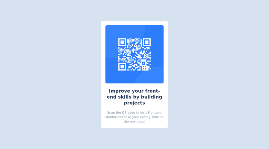
May be this is the easiest challenge on Frontend Mentor 😅 coz I have built it within 1 hour. I tried to solve it using Tailwind CSS to get comfortable as I am just getting started with it. This is my first challenge using Tailwind so please drop any suggestions or helpful articles to improve and also point out the mistakes if you find.
Happy Coding 😃
Community feedback
- @MelvinAguilarPosted almost 2 years ago
Hello there 👋. Congratulations on completing this challenge!.
I have some suggestions about your code that might interest you.
-
Using
h-screen(height: 100vh) for the body element can cause problems with the layout of the page on smaller screens, such as in landscape view on a mobile device.On smaller screens, such as in landscape view on a mobile device, the height of the viewport may be less than the height of the content of the page. In this case, using height: 100vh for the body element will cause the content of the page to be hidden behind the body element.
Here is an image of how it would look on a mobile device (taking into account the scroll): screencapture-himanshuat-github-io-frontend-mentor-qr-code
To avoid this problem, it is generally recommended to use
min-h-screen(min-height: 100vh) instead ofh-screenfor the body element. This will ensure that the content of the page is always visible.
I hope you find it useful! 😄 Above all, the solution you submitted is great!
Happy coding!
1@himanshuatPosted almost 2 years agoThank you @MelvinAguilar. That was helpful. I have updated the component
0 -
Please log in to post a comment
Log in with GitHubJoin our Discord community
Join thousands of Frontend Mentor community members taking the challenges, sharing resources, helping each other, and chatting about all things front-end!
Join our Discord
