Design comparison
Community feedback
- @Kamlesh0007Posted over 1 year ago
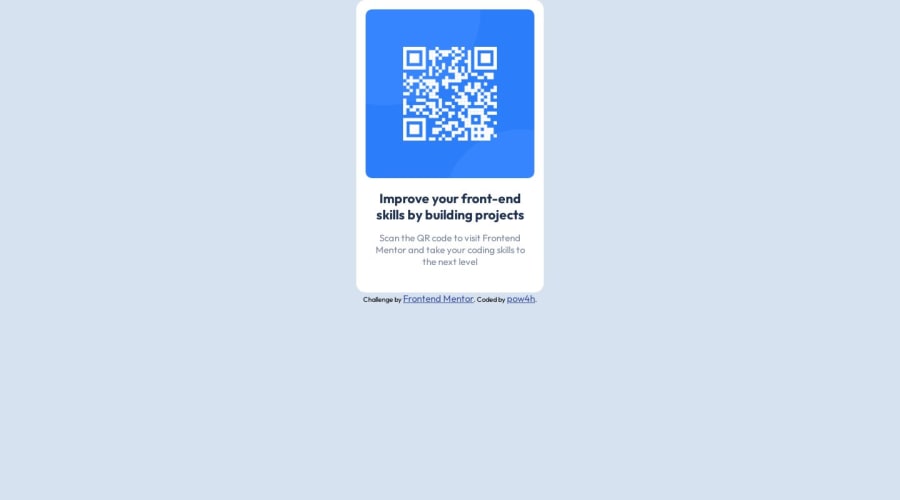
Congratulations on completing the challenge! That's a great achievement, and I'm sure you put a lot of effort into it. I really liked the way you approached the challenge and the code you wrote. You demonstrated a good understanding of the concepts and applied them effectively to solve the problem.I have a few suggestions to improve your code further. When it comes to centering a div or any element on a webpage, using margins may not always be the best approach. so use flexbox or grid layout for centering the div
Here's an example code snippet:
body {
background-color: var(--light-gray);
display: flex;
flex-direction: column;
align-items: center;
justify-content: center;
height: 100lvh;
}
now remove below styles
main {
margin: auto auto;
}
Marked as helpful0@kubas33Posted over 1 year ago@Kamlesh0007
Thanks for answer!
I was trying this at beggining but I forget about justify-content and mistaked align-content with align-items so it didn't work in way I wanted
0
Please log in to post a comment
Log in with GitHubJoin our Discord community
Join thousands of Frontend Mentor community members taking the challenges, sharing resources, helping each other, and chatting about all things front-end!
Join our Discord
