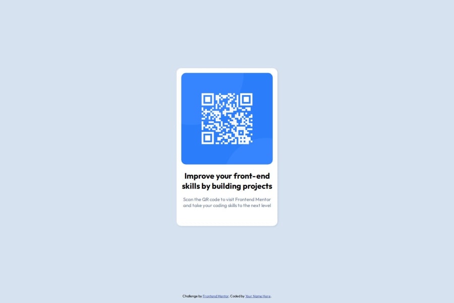
Design comparison
Community feedback
- @FatherSwordPosted 6 months ago
You really did a good job, I believe that the advanced technologies you applied are all very powerful, which help the page become more robust and more beautiful. However, there might be a detail that is not so perfect, maybe you can change the color of the big words right below the QR Code to accord to the sample. Nevertheless, this is really subtle and does not matter too much, therefore I think that you can just ignore this point. Again, it is a really good design!
0
Please log in to post a comment
Log in with GitHubJoin our Discord community
Join thousands of Frontend Mentor community members taking the challenges, sharing resources, helping each other, and chatting about all things front-end!
Join our Discord
