Design comparison
Community feedback
- @correlucasPosted over 2 years ago
👾Hello Paulo, congratulations for your new solution!
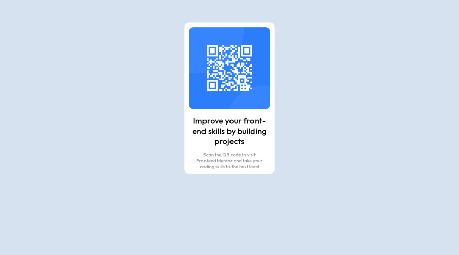
Your solution is already done, now you need to fix its alignment:
I saw that you've used
marginsto give the container its alignment, this works but is really tricky to control all the content. My advice for your is to useflexboxto create this alignment. For example, first of all add to thebodymin-height: 100vhto make the body display 100% of the browser screen size anddisplay: flexeflex-direction: columnto align the child element (the container) vertically using the body as reference.body { background-color: hsl(212, 45%, 89%); min-height: 100vh; display: flex; align-items: center; justify-content: center; }First of all give the correct size for the container with
max-width: 320pxand remove the margins.@media screen and (min-width: 601px) .card { max-width: 320px; text-align: center; background-color: hsl(0, 0%, 100%); /* margin: 5% 40% 5%; */ border-radius: 15px; }👋 I hope this helps you and happy coding!
Marked as helpful1 - @RooneyfullPosted over 2 years ago
Thank you so much Lucas for showing support. I`ll get that fixed ASAP. Hope to see more comments like this on my future solutions. (Or not xD). Btw why did you say max-width: 320px ? How did get this value?
0
Please log in to post a comment
Log in with GitHubJoin our Discord community
Join thousands of Frontend Mentor community members taking the challenges, sharing resources, helping each other, and chatting about all things front-end!
Join our Discord
