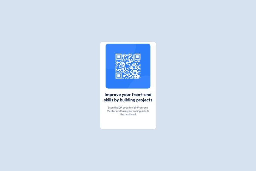
Design comparison
Community feedback
- @DeniztplPosted 4 months ago
I like your code and responsive design. The layout changes when width gets below 600 pixels, I especially like that part. You could add some
paddingto the top of thewrapperclass and some little details can be reviewed but generally I like it. Well done.0 - @hcnabdPosted 5 months ago
. try to split your screen to figma and vscode, so you can see the diff between your code and the design quickly . the figma file almost gave us everything we need, the only thing is left is to code it, we got the margins paddings widths heights, leterally everything, so next time try to copy those values exactly as they are from the figma design to your code
that's all i've got to say, good luck!
0
Please log in to post a comment
Log in with GitHubJoin our Discord community
Join thousands of Frontend Mentor community members taking the challenges, sharing resources, helping each other, and chatting about all things front-end!
Join our Discord
