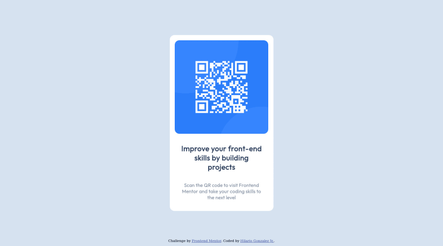
Design comparison
SolutionDesign
Community feedback
- @denieldenPosted over 2 years ago
Hi Hilario, great work on this challenge! 😉
Here are a few tips for improve your code:
- add
maintag and wrap the card for improve the Accessibility - use
min-height: 100vhto body because Flexbox aligns child items to the size of the parent container - instead of using
pxuse relative units of measurement likerem-> read here
Overall you did well 😁 Hope this help!
1 - add
Please log in to post a comment
Log in with GitHubJoin our Discord community
Join thousands of Frontend Mentor community members taking the challenges, sharing resources, helping each other, and chatting about all things front-end!
Join our Discord
