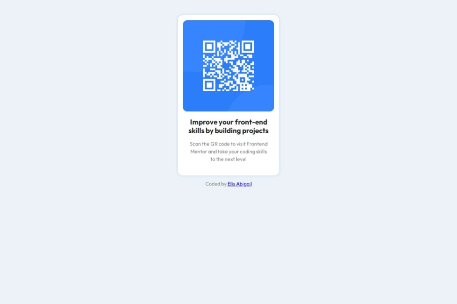
Design comparison
Solution retrospective
Al principio utilice medidas que no eran adecuadas para optimizar la pagina, luego busque ayuda en la comunidad y pude observar muy buenas recomendaciones y logré optimizarlo, lo cual me pone muy contenta, poder contar con una cálida y colaborativa comunidad dispuesta a ayudar.
What challenges did you encounter, and how did you overcome them?Como expliqué anteriormente mi mayor problema eran las medidas ya que nunca supe cuales eran la mejor opción en cada caso para distintas dimensiones de la pagina o al hacer zoom en la misma, que no se perdieran las proporciones, pero buscando soluciones en discord pude resolverlo.
What specific areas of your project would you like help with?Me gustaría más ayuda con estilos y con la semántica correcta en HTML.
Community feedback
- P@kaamiikPosted 3 months ago
You did this really good. Congratulations. Just a few notes:
- The footer is outside the card and is not a section footer role. I think you need to shift it outside the
mainelement.
- Try to use a proper CSS reset at the start of your CSS style. Andy Bell and Josh Comeau both have a good one. You can simply search on the internet to find them.
- No need for this
width: 100dvw;. We just add `min-height to center our div.
Keep on the great work!
Marked as helpful0@abigailelisPosted 3 months ago@kaamiik Thank you very much, I tried to make those changes. Can you see my new code to tell me if it's okay now? Thank you for taking a few minutes to respond to me
0P@kaamiikPosted 3 months ago@abigailelis Sure.There are some suggestions too:
- You can remove your
sectionhere. There is no need to have it here.
- Each Page should have a
h1heading. In this challenge though, Because in a real scenario the QR code is part of another page It does not need to haveh1and you have to use ah2because headings should only increase one by one and screen readers use this hierarchy to navigate through content efficiently, making it easier for visually impaired users to understand the page structure. It also has SEO benefits and organize your code.
- Inside your body add a
display:flex;,flex-direction: column;,justify-content: centerto put your card at the center of the page. At the end (this is a suggestion) add aflex: 1;to your main. this property let the main grow and your footer goes to the bottom of the page.
- Always use one Github repo for each project. This is a really bad practice to wrap all of your project in one repo and there is no positive point inside of it.
You did this project really well and these problems are normal. Keep on and get feedback after every project and refactor your code always.
Marked as helpful0@abigailelisPosted 3 months ago@kaamiik Thanks!!!! I applied all the points!!
1 - The footer is outside the card and is not a section footer role. I think you need to shift it outside the
Please log in to post a comment
Log in with GitHubJoin our Discord community
Join thousands of Frontend Mentor community members taking the challenges, sharing resources, helping each other, and chatting about all things front-end!
Join our Discord
