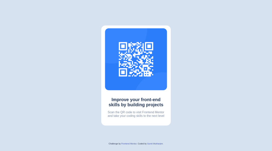
Design comparison
Solution retrospective
Hyy everyone I tried to build this qr component but I am having probelm with text of header and paragraph, I am not able to make it in two lines
Community feedback
- @abelmoradPosted over 1 year ago
Reduce your .qr-header { font-size: 24px }
I would recommend using rem instead of px in your text because a pixel is not responsive, so it's better to use rem. ex. .qr-header { font-size: 1.8rem }
more info : https://uxdesign.cc/why-designers-should-move-from-px-to-rem-and-how-to-do-that-in-figma-c0ea23e07a15
2@sumitmukharjeeeeeePosted over 1 year ago@abelmorad Thanks for the help just updated the solution and also read your suggested article. Helped me a lot
0 - @MelvinAguilarPosted over 1 year ago
Hello there π. Good job on completing the challenge !
I have some suggestions about your code that might interest you.
CSS π¨:
- Having text elements with two lines is trial and error, you can use the following styles to make it look like the design:
.qr-header { /* font-size: 32px; */ font-size: 1.5rem; /* 1.5rem = 20px */ } .qr-para { /* font-size: 1.5rem; */ font-size: 0.938rem; /* 0.938rem = 15px */ }
- The
width: 100vw
property in thebody
tag is not necessary. This will create a horizontal scrollbar on some devices.
- Use
min-height: 100vh
instead ofheight
. Setting the height to 100vh may result in the component being cut off on smaller screens, such as a mobile phone in landscape orientation.
I hope you find it useful! π Above all, the solution you submitted is great!
Happy coding!
2@sumitmukharjeeeeeePosted over 1 year ago@MelvinAguilar Thanks for the suggestion, revised the codeπ
1 - @g-pgPosted over 1 year ago
Try to reduce the font size of both the title and the description!
2@sumitmukharjeeeeeePosted over 1 year ago@g-pg Thanks just updated the solution. I came to find out that rem is more responsive than px
0 - @0xabdulkhaliqPosted over 1 year ago
Hello there π. Congratulations on successfully completing the challenge! π
- I have other recommendations regarding your code that I believe will be of great interest to you.
HTML π·οΈ:
- This solution generates accessibility error reports due to
non-semantic
markup, which lack landmark for a webpage
- So fix it by replacing the element
<div class="attribution">
the with semantic element<footer>
in yourindex.html
file to improve accessibility and organization of your page.
- What is meant by landmark ?, They used to define major sections of your page instead of relying on generic elements like
<div>
or<span>
- They convey the structure of your page. For example, The
<footer>
typically contains information about the author of the section, copyright data or links to related documents.
I hope you find this helpful π Above all, the solution you submitted is great !
Happy coding!
1
Please log in to post a comment
Log in with GitHubJoin our Discord community
Join thousands of Frontend Mentor community members taking the challenges, sharing resources, helping each other, and chatting about all things front-end!
Join our Discord