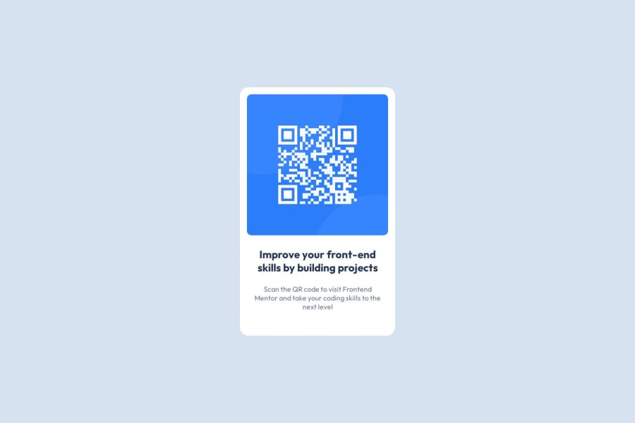
Design comparison
SolutionDesign
Solution retrospective
What are you most proud of, and what would you do differently next time?
Nothing in particular, I'm a backend engineer that just started my journey learning about front end development.
What challenges did you encounter, and how did you overcome them?- I'm not sure about the HTML semantic that I should use.
- For the card weight, I take the value from figma file (320px). Is that correct?
- I don't know the correct font-size for the title in the card. I just randomly picking the font-size (1.5em for h1) to try to match the design as close as possible. What's the correct way of doing this?
- I need to know what HTML semantic that I should use in certain situation.
- How to choose the size of the font correctly?
Community feedback
Please log in to post a comment
Log in with GitHubJoin our Discord community
Join thousands of Frontend Mentor community members taking the challenges, sharing resources, helping each other, and chatting about all things front-end!
Join our Discord
