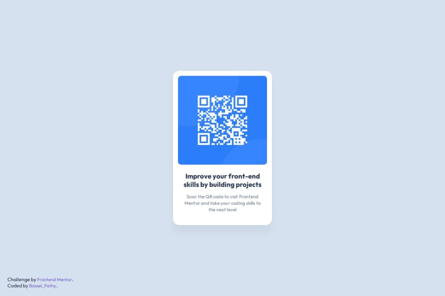
Design comparison
Solution retrospective
Proud of following the guidelines of the figma design.
What challenges did you encounter, and how did you overcome them?Didn't face challenges so far.
What specific areas of your project would you like help with?For this project, I don't think there is something I need help with.
Community feedback
- @grace-snowPosted 5 months ago
Well done on this. There are some problems and potential improvements however.
- link fonts in the html head using all code supplied by Google fonts not a style tag with css imports inside. Google fonts will provide 3 lines of html to include.
- it's great you've used a main landmark, but this component should be inside the landmark, it shouldn't be the landmark.
- the image in this is the most important content on the page. That means it must be in the html and have alt text; it can't be a background image.
- once you add the image it won't need wrapping in a div either.
- think about this as a single component that will be dropped into a page. This component would never be used to serve the main heading on a page so you know it shouldn't have a h1. Use a lower importance heading level like h2 instead.
- get into the habit of including a full modern css reset at the start of the styles in every project. Andy Bell or Josh Comeau both have good ones you can look up and use.
- you must not set font size on the html element, especially not in px. That immediately makes the solution less accessible as this will no longer honour the end user's text size settings. Instead only ever set font size on the body element or other elements rendered on screen. And always ensure font-size is set in rem, never ever pixels. More info:https://fedmentor.dev/posts/font-size-px/
- the card shouldn't have a width. Use max-width in rem instead. This will allow the component to be responsive — it can shrink narrower when it needs to like on small screens — and it will ensure the layout scales for everyone, including those with different text size settings.
- there's no benefit to making the card into a flex column unless you're planning on using the gap property. Block elements stack by default so all that's doing currently is making the css longer.
- once you've added the image in html it won't need a width or height. All it needs for sizing is what's already included in the css reset : display block and max-width 100%. You can optionally set the width to 100% but it's not necessary. Including aspect-ratio 1 would bring a small performance boost.
- because the footer attribution has been set to position absolute it's overlapping the content sometimes. It's unnecessary to set it absolute at all. Let the footer sit naturally where it sits.
Marked as helpful2@BasselfathyPosted 5 months agoThanks for your feedback @grace-snow , really appreciate these valuable notes.
Just improved the code.
0
Please log in to post a comment
Log in with GitHubJoin our Discord community
Join thousands of Frontend Mentor community members taking the challenges, sharing resources, helping each other, and chatting about all things front-end!
Join our Discord
