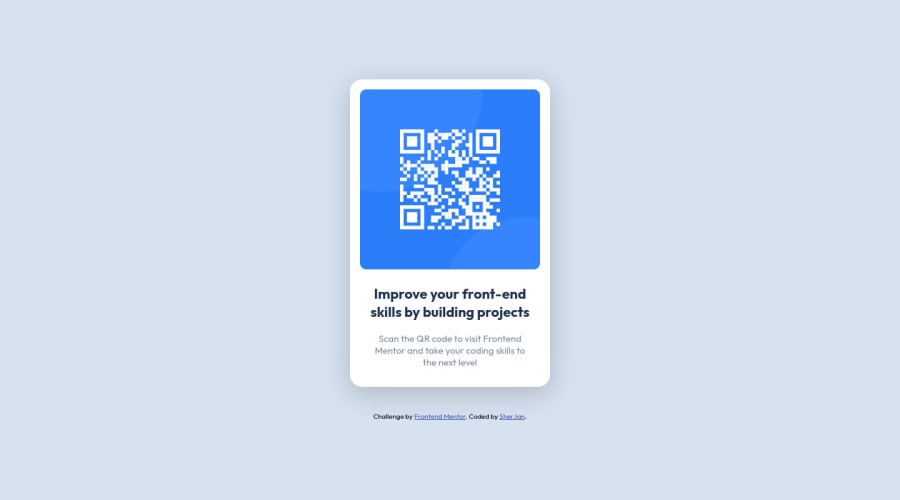
Design comparison
Solution retrospective
Spend like a whole day figuring out everything on my own without relying on any solutions, I feel like I have made many logical mistakes and mostly a bad flow with my CSS, if anyone thinks my CSS is bad or there are pain-points. Please do let me know. Open to critiquing, Feedback is welcomed!
Community feedback
- @kkulekPosted about 2 years ago
Hey @sherySJ! For a first project it's much better than you think
You've positioned a body using flex-box - thats great! And in the card you used paddings/margins to position the content.
If you would like to optimize your next project, you can position elements with a flexbox not only in the body.
This method you can faster optimize bigger projects for different screen sizes. As an example of similar project you can look at this: https://kkulek.github.io/simple-nft-preview-card-component/
Every container can be positioned using flex-box / grid. For the bigger projects (like landing pages) this is a better way and you benefit if train that.
Another thing to take into consideration is your CSS namings. Take a look at BEM methodology (or other).
It not only help you organize CSS but also set a good funtation for SASS. This YT material may help: https://www.youtube.com/watch?v=SLjHSVwXYq4
Good luck and great delivery!
Marked as helpful1@sherySJPosted about 2 years ago@kkulek wow! First of, a big THANK YOU for the amazing feedback and the resources!
About the flexbox part, i was fiddling with applying flexbox on each individual div as i was getting more granular, but for some reason the padding and margin properties were weirdly breaking so I ended up macgyvering by applying flexbox on the whole body to get it to not break (lol).
Also the resources, this is exactly what I was lacking and i couldnt put my finger on where I was falling behind exactly, so Thank you for your thoughtful feedback!!
0 - @AdrianoEscarabotePosted about 2 years ago
Hello
Congratulations on the challenge! Welcome to the front-end mentor community.
I have some tips for you to improve your code:
1- Put a side padding on the body so when the screen is smaller the layout content doesn't hit the edge.
2- Another tip so you can set margin and padding to zero for all elements:
* { margin: 0; padding: 0; box-sizing: border-box;}
The rest is really good! Congratulations
Hope it helps...don't forget to mark it as helpful 👍**
Marked as helpful1
Please log in to post a comment
Log in with GitHubJoin our Discord community
Join thousands of Frontend Mentor community members taking the challenges, sharing resources, helping each other, and chatting about all things front-end!
Join our Discord