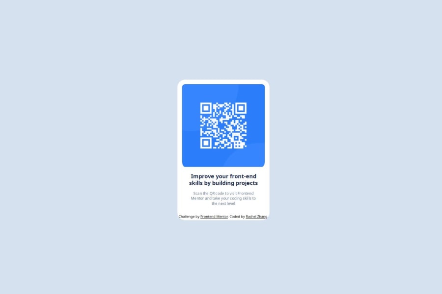
Design comparison
SolutionDesign
Solution retrospective
What are you most proud of, and what would you do differently next time?
- It's good to be out of tutorial hell.
- I'd be more careful with the measurements of design. Try to recreate a closer looking version. Also do better at responsive design.
- Had difficulties centering object and checking the space each component takes.
- MDN documents and browser dev tools helped me out.
- Not familiar enough with Github yet.
- How can I do better at getting the measurements as close to the original design?
Community feedback
Please log in to post a comment
Log in with GitHubJoin our Discord community
Join thousands of Frontend Mentor community members taking the challenges, sharing resources, helping each other, and chatting about all things front-end!
Join our Discord
